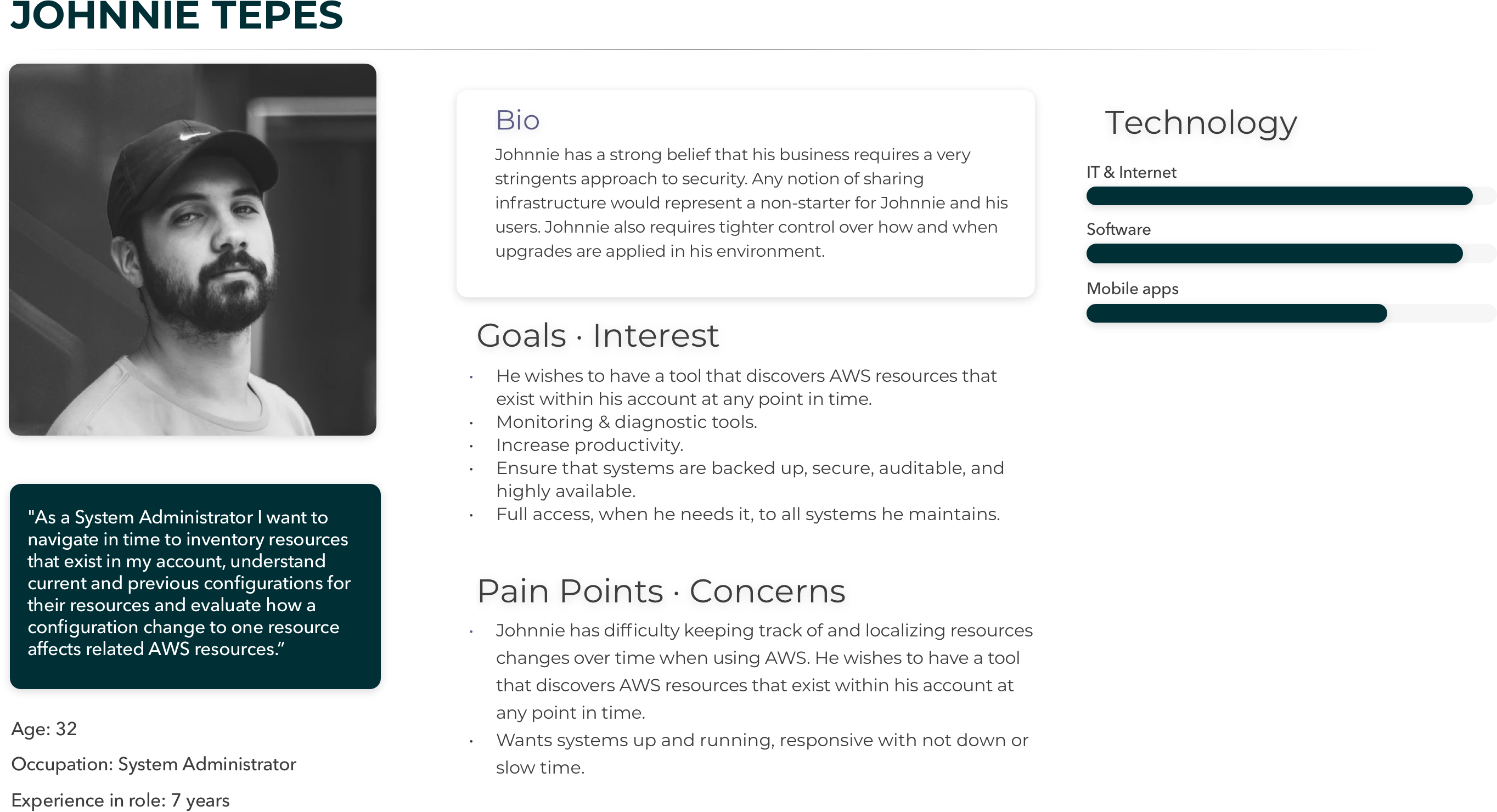
Building AWS Config

I have omitted and obfuscated confidential information in this design case study. All information in this example is my own and does not necessarily reflect the views of AWS (Amazon Web Services).

Just AWS

Discovering AWS

AWS Config was the first product in a new line of AWS cloud computing tools designed to assess, audit, and evaluate the configurations of your AWS resources.

Project Details

  • Company: Amazon Web Services (AWS)
  • Product: AWS Console
  • Year: 2014
  • Tools: axure rp

The four month sprint to launch AWS Config

Based on a series of interviews and user surveys to AWS customers, there was a demand for a service that continuously monitors and records AWS resource configurations and allows to automate the evaluation of recorded configurations against desired configurations.

The following content shows some of the qualitative data obtained during the interviews regarding user's needs.

  • AWS customers wish to have a tool that discovers AWS resources that exist within his account at any point in time.
  • Have a visual way to see how changes occurs in the pass.
  • Many customers had difficulty keeping track of and localizing resources changes over time when using AWS.
  • Be able to troubleshoot why a resource may have stopped working properly.

Discovering AWS

Learn more about AWS Config

Process

My product design approach included:

  • Product discovery and creative collaboration with the engineering team.
  • Defined the potential user via user research activities.
  • Executed fully-interactive solution prototypes for user testing and leadership feedback.
  • Managed UI "fit & finish" activities before launch.
  • Post-launch usability testing, redesign, and new feature creation.

Understanding the user

Who are we designing for?

We began by exploring our assumptions about how potential users discover AWS resources that exist within an account at any point in time. For example, our first reaction was to provide a datepicker control to navigate in time to see changes of configuration. After speaking to our users we would end up finding a better approach.

Next, we wrote questions to prompt the interviewees to tell their story in their words. The intention was to get these people to tell us what was important to them when looking for configuration across different AWS resource types.

The first round of interviews produced a number of distinct clear trends.

Key insights:

  • A simple way to navigate in time to see changes.
  • Date picker was the wrong UI to look for dates.
  • Relationship between details about configurations of every resource and time.
  • Visuals will help users to have a clear view of changes.

Next, I created a provisional persona of a potential user based on PM knowledge and my understanding of the user. This persona was created with assumptions and not fully research-based but it was something that I came back to throughout my project to guide my design decisions and priorities.

AWS Config Persona

"Working backwards"

Before I could jump into designing, it was important to define success and understand the requirements.

Due to the complexity of the system I was designing for, creating a task flow helped me represent the logic sequence of the user's flow from the starting point to accomplishing a task.

AWS Config task flow

Ideating via Wireframing

What are the ways we could solve the problem?

After our Information Architecture was completed, the wireframing began in earnest. I usually start the design process with low fidelity sketches. This is the way I explore more technical aspects of the design.

Now that we understood our customers and narrowed down the problem we were trying to solve; we could think how we would go about it.

Wireframing & IxD

Due to the complexity of the project, the Design phase was the most challenging of all. Especially when thinking about how the controls will behave on demand. Information is displayed according to options selected. Also, I need to figure it out how to allow users to "navigate in time" to look for changes.

Step 1

I start by enabling AWS Config for my account (within a particular Region). I can create a new SNS topic and S3 bucket, use a topic and bucket of my own, or I can use a topic and a bucket that belongs to a different AWS account.

Step 2

I need to provide AWS Config with access to my AWS resources. This is done using an IAM role.

Image shows Configuration
Defining the Product.

Step 3

The Console lets you select a resource and then view configuration changes on a timeline.

Image shows Select Resource

IxD

Challenges explained

The initial feedback provided enough information to evaluate what needs to improve in the overall design. The following shows the IxD challenges I faced and their solutions.

Bucket Path Builder by Carlos Marin Burgos

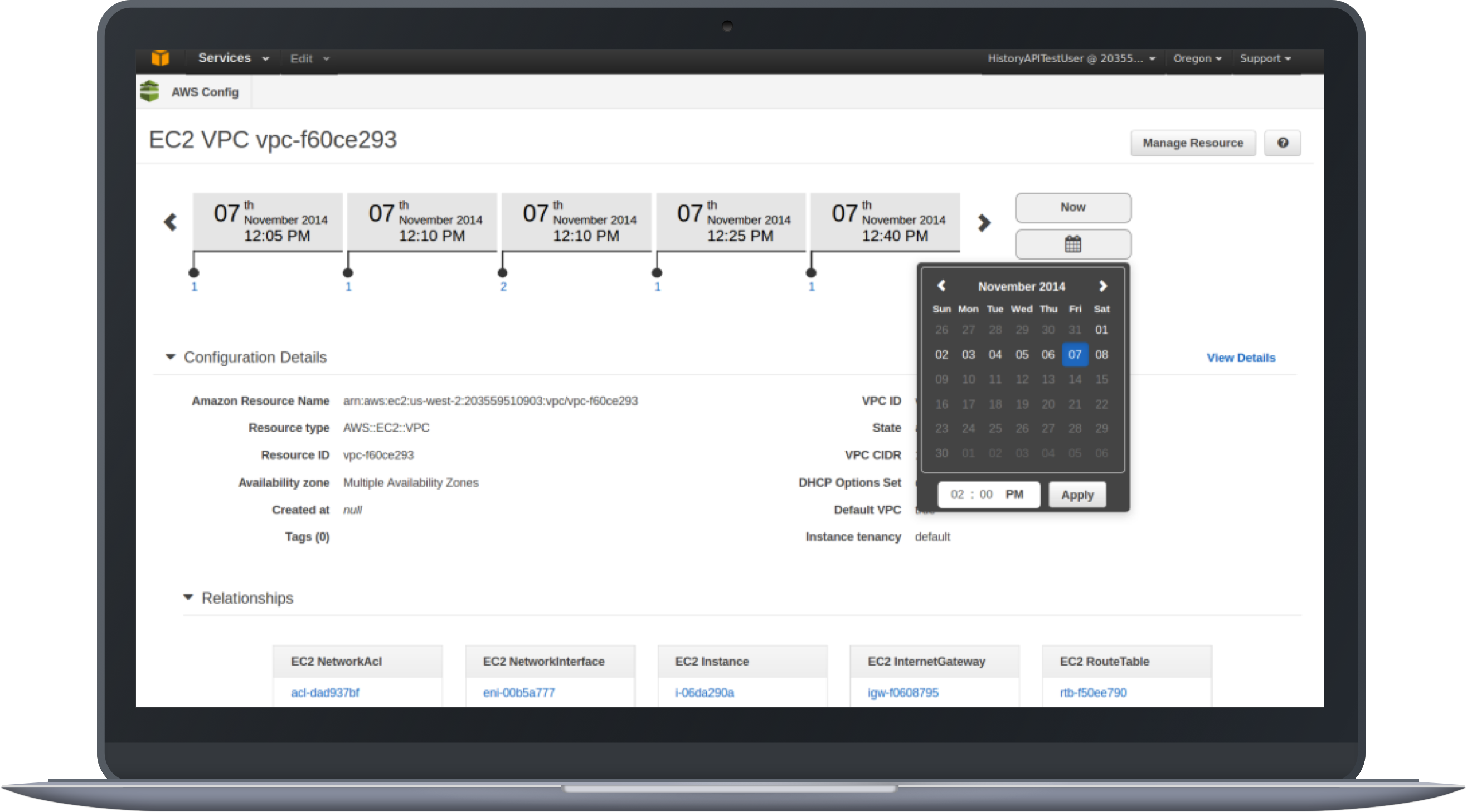
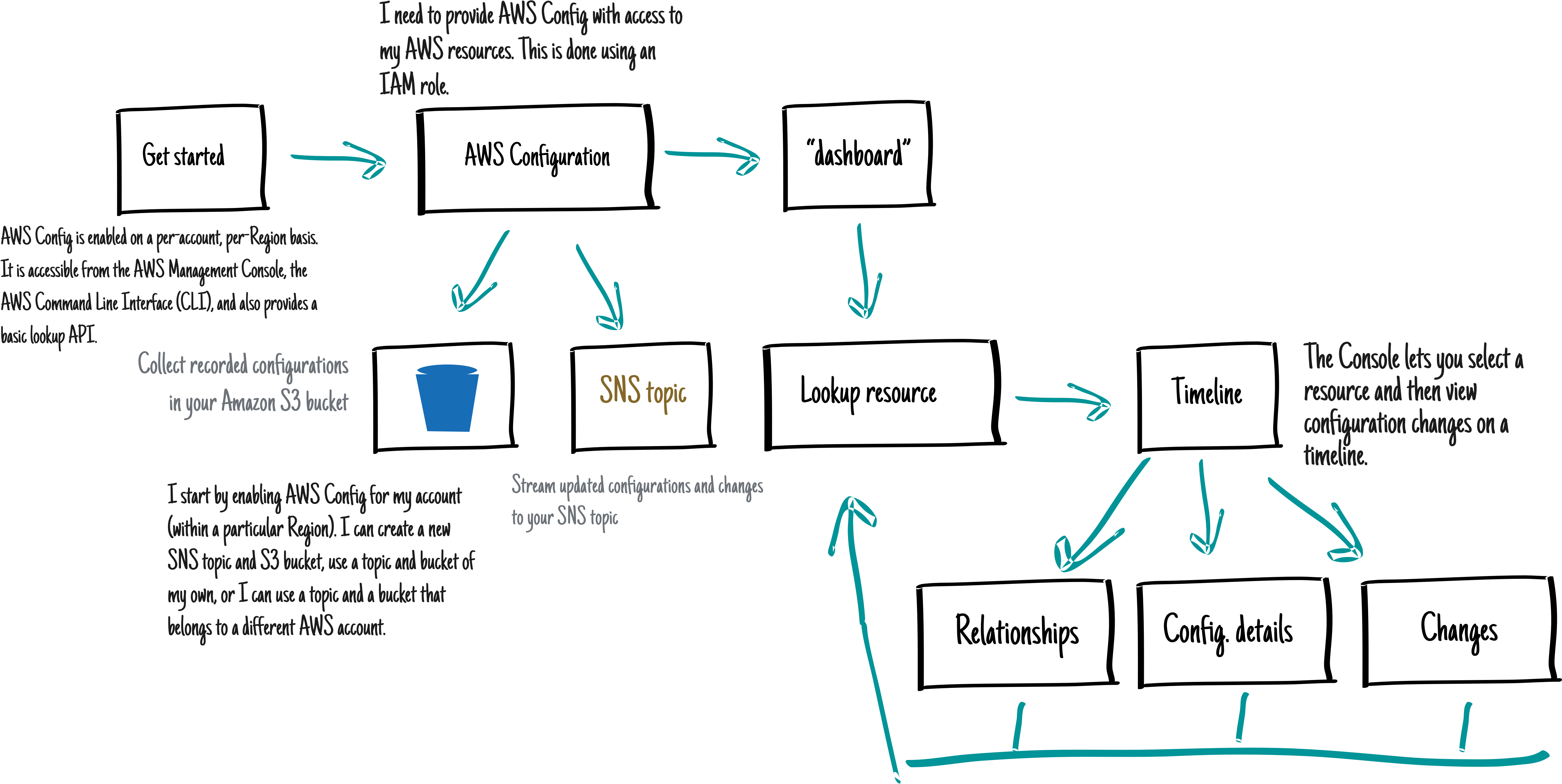
AWS Config tracks changes in the configuration of your AWS resources, and it regularly sends updated configuration details to an Amazon S3 bucket that you specify. Set up an Amazon S3 bucket to receive a configuration snapshot on request and configuration history.

Bucket Path Builder

To create a Bucket, users need to assign a name, prefix, and suffix. Name and suffix are required fields. The prefix is optional. To facilitate the process, we are providing the Suffix (current region) in the path.

Feedback regarding the interaction when creating Buckets was negative. Participants did not understand the process of creating the path, especially the Prefix located under the textbox. "It does not look like a path."

"It doesn't look like a file path."

As a result, I ideated a more simple and engineering way to create a path for Buckets.

Bucket Path Builder UXDG Patent

The following shows the prototype that I used to test the Path Builder (hand coded).

Interaction

Once the user starts entering the name for the bucket, a hypelink to the bucket is created below. As a result, users can navigate or copy the location of the bucket.

Lookup Resource

Having a Radio button as a control to select between Resources and Tags made sense to the users. Only one can be selected. However, two major features were missing for the UI. Multiselection for Resouces and the Resource identificator and the Tag value. Although they are optional values were demanded by users.

HTML to the rescue!

I wanted to test the responsiveness of the design so I developed the following version on html to test it with different viewports.

Story of a timeline

The different iterations based on user feedback

When you look up resources on the Resource inventory page, user clicks the resource name or ID in the resource identifier column to view the resource's details page. The details page provides information about the configuration, relationships, and number of changes made to that resource.

The blocks at the top of the page are collectively called the timeline. The timeline shows the date and the time that the recording was made.

Again, one the of the most critical UI pieces of AWS Consists of the Timeline. We had to make sure that users would understand the time navigation concept.

Define timeline
Timeline ambiguity

Research

Timeline navigation

Again, it was challenging to design a tool for navigating in time to see changes without breaking some *UXDG patterns. The first unsuccessful attempt was to use only UXDG components.

Feedback from users suggested investigating another way to allow customers to navigate through time in a more intuitive and aesthetical way.

The responses obtained from users after showing the previous mock stated that using a Date Picker control, to see changes of resources over time, was not the correct solution. Date Pickers consist of input controls where users enter data to obtain a result. The user feels like in an Easter Egg hunting trying to see changes. Contrary, we were looking for a control that helps users to visualize a series of changes over time without entering any input.

Image shows the date picker control available in the UXDG library

This begged the question, how might we help customers navigate through time? Our proposal was a Timeline.

During my Investigation phase, I looked for examples of timelines UIs used in different applications.

One that really caught my eye for its simplicity was the Google Analytics mobile app. The purpose of the app is to link Data and Time through a time line. Bingo!

Image shows the date picker control available in the UXDG library

You can see the use of the timeline to navigate via time. User selects a date and the information diplays according to the selected date.

“...how might we help customers navigate through time?”

Ideation

Timeline concepts

I was surprised by the issues we found testing the first concept. The main problem consisted of locating the "changes point" indicators on the timeline.

We wanted to make sure that users understand that changes happen at the beginning of a period of time. As a result, if the "Change Point" is in the middle of the "timeblock", it creates confusion to users regarding when the change occurred.

Solution. We justified the "Change Point" marker to the left. Even though that it seems like a complex concept, users did understand the meaning having the indicator of the changes in the left position on the "TimeBlock".

First concept

First iteration
First iteration

Second concept

The next design shows another variation of the TimeLine. For this case, we display all the possible information inside a "block time", including the number of changes.

The problem with grouping all the information raises the difficulty of users to scan for a determined type of information. “The information seems to be too clustered.”

Second iteration
"Block time"

Another concept that displays a starting and ending point with the changes in the middle.

Adding a starting point to the time line creates confusion to users. The position of the starting point may vary. As a result, the interaction generates a continuous “jumping around” effect that disorients the user.

The solution is to position the starting point always at beginning of the time line (Left side).

Third iteration
Flowchart look and feel

New approach in the design. This look eliminates the "flowchart" feeling from the previous designs.

The arrows on the "TimeBlocks" produces a "flowchart" effect rather than a time line feeling. In addition, the direction of the arrows gives the wrong information about the direction of the timeline. In our case, we want to represent that time starts from left to right.

Also, circles with a number represent the number of changes. The change helps to separate the two most important pieces of information, Time and Changes.

Discoverability is an issue in this design. Many users did not understand what the number inside the circle represents. They need to mouse over to see the "Changes" label.

“...is this a flowchart?.”
Fourth iteration
Lack of discoverability

Final version presented at Re:invent 2014

Several visual design improvements help to obtain positive feedback from users. ready to test!

See the different interactions for the Timeline. HTML page.

Winner iteration
Final design. Re:invent 2014

Prototyping

Iterating to Hi-fi Mockups

Prototyping was the most effective way to gain meaningful feedback from the team, quorum from stakeholders and approval from leadership.

For the TimeLine prototype I decided to use Axure RP to show the design and interaction of the idea. One of the main reasons why I decided to use Axure to develop the prototype was the limit of time that I had to transform the idea into a playable artifact.

Axure Prototype
Axure RP prototype

One problem that I had to face as a result of using Axure for developing the prototype consisted of the animation limitations of the tool. It was complicated to match the effect that we were looking for when navigating through pages using the direction controls.

HTML to the rescue!

If you're building a prototype for the web, it makes sense to build it in its natural environment. It would provide to participants as real an experience as we could hope to gain.

Also, the web prototype can adapt to the width of the browser window but a static wireframe can't. This is useful when demonstrating how your site adapts at different screen widths.

look up resources
Timeline HTML prototype

Evaluate

Did we get it right? Is there a better way?

After the first round of usability testing, we were at a point where we could find out what this console looks like. I created a style guide to establish consistency in our mockups from all consoles partners.

We tested the new Config timeline UI, looking for usability problems. We also talked to participants about what they would use a tool like Config for, looking for what kind of functionality is needed to solve the users’ real problems.

We had 7 participants, where 4 were already recruited as beta users of AWS Config and the remaining 3 were from our usability panel. 5 out of 7 users managed large AWS installations, while the remaining two had less than 10 instances.

  • All participants liked having a visual timeline to navigate the data.
  • All participants navigated the timeline well.
  • Config was thought particularly useful for reverse lookups, such as seeing which instances were associated with which security group or autoscaling group.

Communicating design

I created design artifacts providing the tech teams the CSS styles and all other definitions to accelerate the development phase and reduce coding time.

redlines for the timeline

The only new design specs were focused on the timeline design. The rest of the controls specs were delivered via the UXDG library. From this library, devs can see all the specifications of the controls used within AWS.

redlines for the timeline

What the community is saying

“Carlos’s design approach has produced one of the most creative consoles for our services.”

Sr. Manager Product Management at AWS
What the community is saying

Challenges

One of the main purpose of the AWS Config console is to allow users to navigate through time in order to be able to search, browse and analyze data. At that point in time, AWS lacked a control to allow the customer to navigate in time. The only control in the UI library close to what I was looking for consisted of a date picker control.

One big UI challenge that I have to face consisted of figuring out how to allow users to navigate between dates.

As a result, the biggest challenge for this project consisted of convincing leadership that the use of a timeline is the correct approach to solve the navigation between dates.

Skepticism was one of the biggest challenges that I faced during the completion of this project.

It was challenging to design a tool for navigating in time without breaking some AWS *UXDG patterns.

*UXDG is the design library for AWS. And if you break any design rule..."They will strike down upon thee with great vengeance and furious anger those who would attempt to poison and destroy their DESIGN PATTERNS. And you will know my name is the Lord when I lay my vengeance upon thee...”

What I learned

What I enjoy the most during the process was talking with the potential AWS customers. I enjoy the moment when the participant allows me to understand through their perspective what they looking for, what they need, what they are struggling with.

By making prototypes, including failed ones, I have learned how to separate the user's needs from my own perspective of the solution.


Carlos Marin Burgos
Website Designed and Hand-Coded by Carlos Marin Burgos