WHAT IF THERE WAS A WAY TO MONITOR AND RECORD CONFIGURATION CHANGES?
DESIGN BY INNOVATION
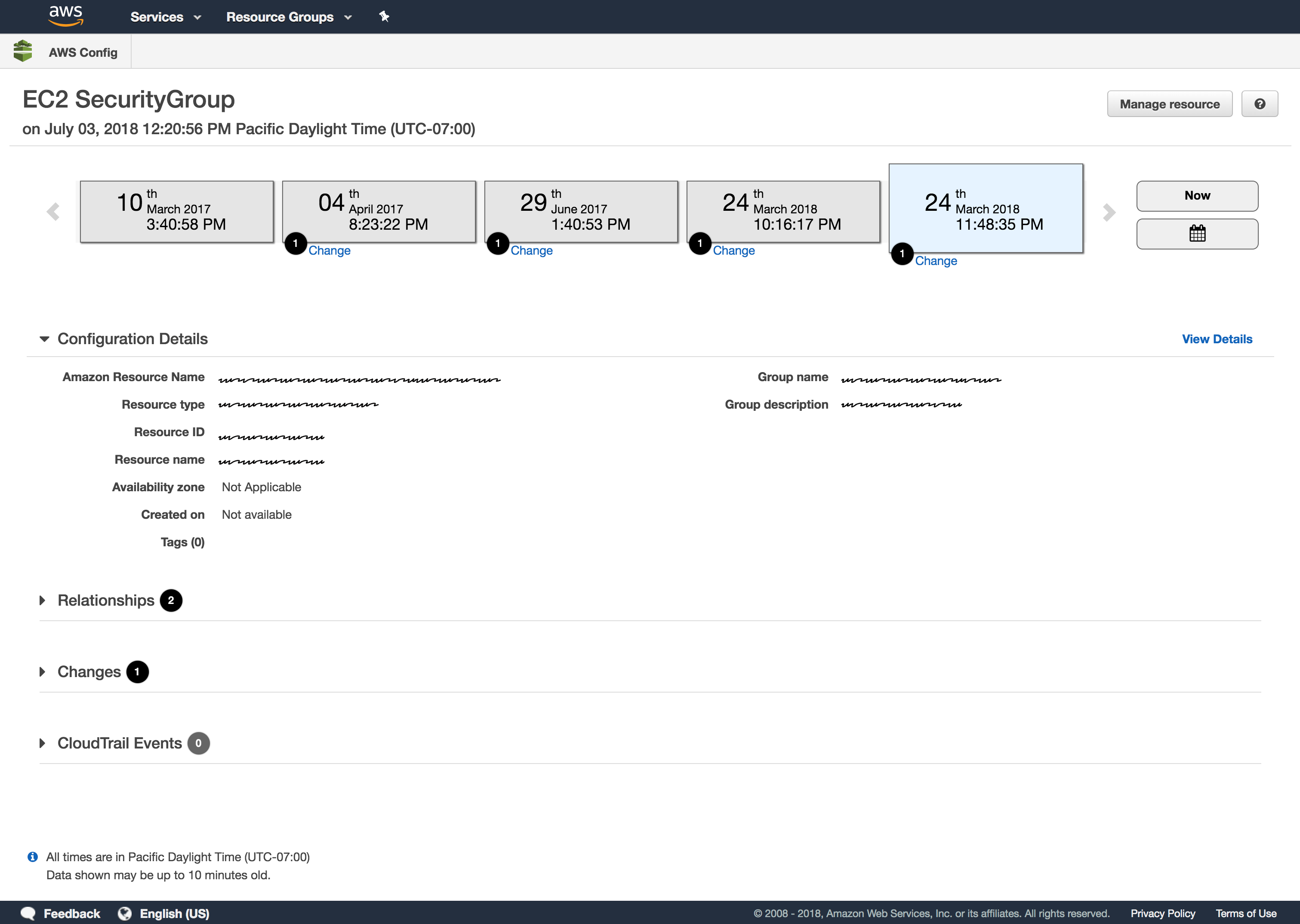
AWS Config (Amazon Web Services Config) is an Amazon cloud auditing tool that provides an inventory of existing resources, allowing an administrator to accurately track AWS assets to analyze compliance levels and security. It also enables an administrator to troubleshoot why a resource may have stopped working properly.
With Config, you can review changes in configurations and relationships between AWS resources, dive into detailed resource configuration histories, and determine your overall compliance against the configurations specified in your internal guidelines. This enables you to simplify compliance auditing, security analysis, change management, and operational troubleshooting.
DESIGN THE MAGIC IN 3 MONTHS
My goal for this project was to design the entire new AWS Config console from beginning to end prior to its release during reInvent .
- Discover AWS resources that exist within an account at any point in time.
- Get a consistent view of resource configuration across different AWS resource types.
- Access full history of changes to your resources and relationships over time.
- Get details about configurations of every resource.
- Visualize dependencies between different AWS resources through the published relationship model.
My role
- CONDUCT RESEARCH. Research potential users to find out what their goals and needs are in order to determine product value.
- COLLABORATE ACROSS DISCIPLINES. Leading - 1 hour Design Studio. This workshop gathers various team members into a room to sketch solutions around a single focused scenario and a prioritized set of features. The goal is to uncover use cases, gather ideas, and provide insight to other team members to make planning smoother.
- DELIVER DESIGN DECISIONS. Led the team through a thoughtful and meaningful process making incremental design decisions along the way. These decisions are delivered in many forms such as a conversation, sketch, whiteboard session, wireframe, detailed mockup, or a prototype.
- SEEK FEEDBACK. I sought feedback from users and stakeholders constantly sharing my work with fellow design peers and gather feedback.
- COMMUNICATE EARLY AND OFTEN. Being part of a Balanced and Agile team means I communicate with the team as a leader, facilitator, and educator. The team rely on me to lead how the product will act and look, facilitate conversations to gather feedback and educate the team on research findings.
Communicating Design
Amazon upholds infamously high standards for the work it produces both externally for customers and internally for team members to consume.
This has created a culture which seeks to earn trust through accountability, diving deep into the details and inviting others to scrutinize work. Heavy documentation is the artifact of such a culture.
The size of this project and structured waterfall approach meant that I needed to have everything figured out before teams would commit to moving forward with the work. Many teams involved in the project needed to see it in a tangible document. This risk-averse mindset meant I created a lot of reference documentation that was widely distributed and a high overhead to maintain.
I decided to follow the Lean UX Design Thinking process to make sure that my design decisions were supported by user research and feedback.
UNDERSTANDING THE USER
Who
To start off, I created a provisional persona of a potential user based on PM knowledge and my understanding of the user. This persona was created with assumptions and not fully research-based but it was something that I came back to throughout my project to guide my design decisions and priorities.

WHAT ELSE HAS AWS TRIED?
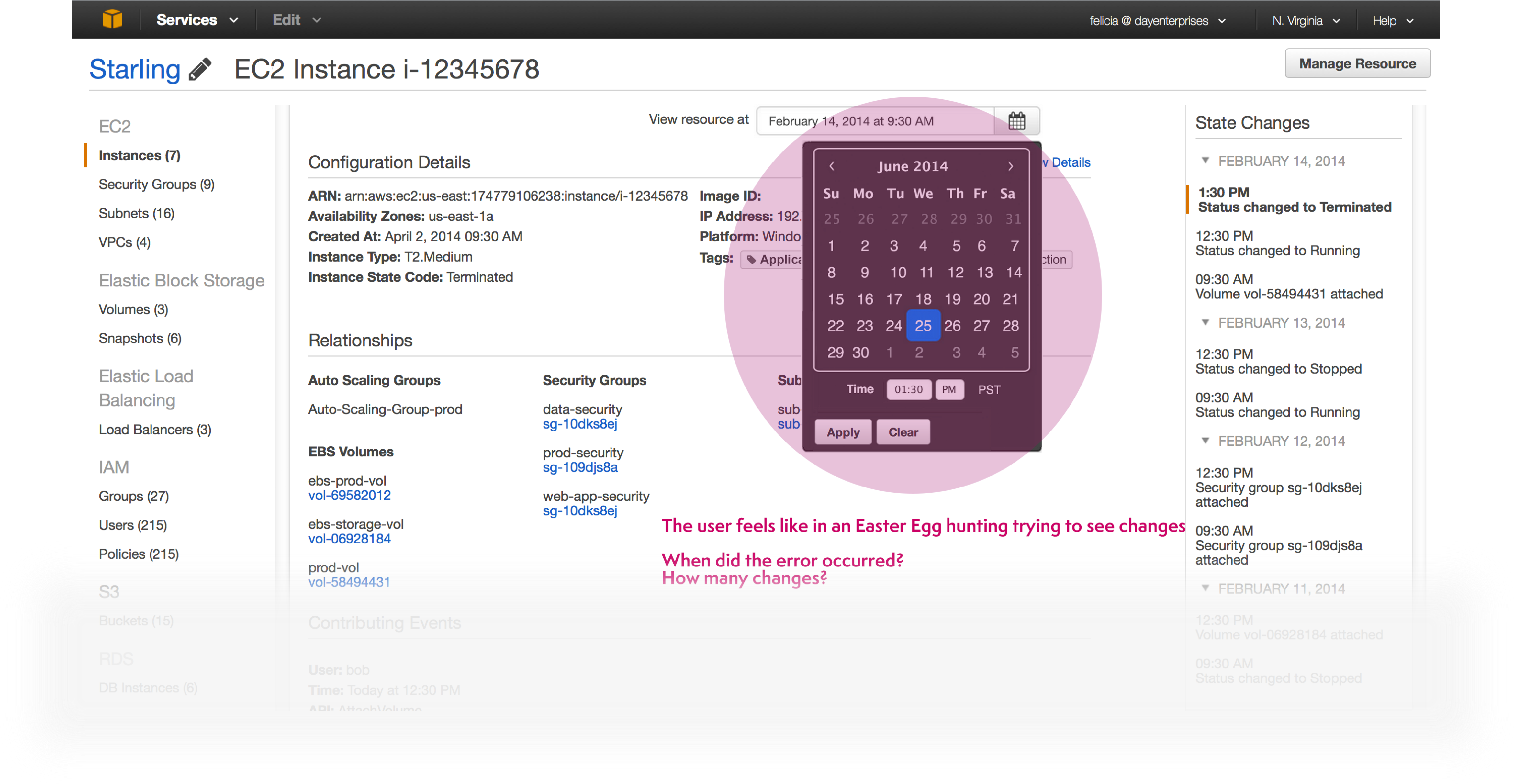
Again, it was challenging to design a tool for navigating in time to see changes without breaking some *UXDG patterns. The first unsuccessful attempt was to use only UXDG components.
Feedback from users suggested investigating another way to allow customers to navigate through time in a more intuitive and aesthetical way.
The responses obtained from users after showing the previous mock stated that using a Date Picker control, to see changes of resources over time, was not the correct solution. Date Pickers consist of input controls where users enter data to obtain a result. The user feels like in an Easter Egg hunting trying to see changes. Contrary, we were looking for a control that helps users to visualize a series of changes over time without entering any input.
IS THERE ALREADY ANOTHER SOLUTION? IF SO, DOES IT WORK?
During my Investigation phase, I looked for examples of timelines UIs used in different applications.
One that really caught my eye for its simplicity was the Google Analytics mobile app. The purpose of the app is to link Data and Time through a time line. Bingo!
You can see the use of the timeline to navigate via time. User selects a date and the information diplays according to the selected date.
WORKING BACKWARDS FROM PERFECT
Before I could jump into designing, it was important to define success and understand the requirements.
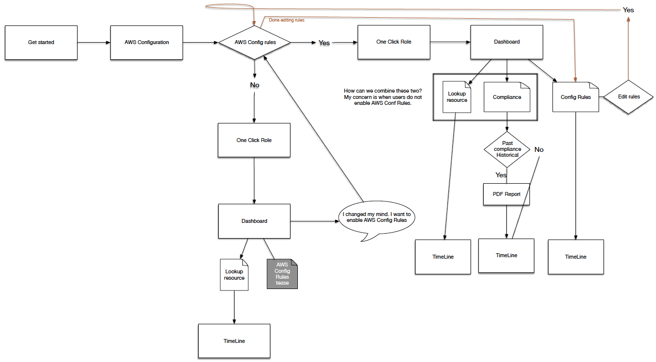
Due to the complexity of the system I was designing for, creating a task flow helped me represent the logic sequence of the user's flow from the starting point to accomplishing a task.
My process involved sketching and white‐boarding concepts and flows with my PM partner and then translating these directly into hi‐fidelity design comps. Since I was working with many existing design patterns, it was relatively easy to move straight into hi‐fidelity designs
“...how might we help customers navigate through time?”
This begged the question, how might we help customers navigate through time? Our proposal was a Timeline.
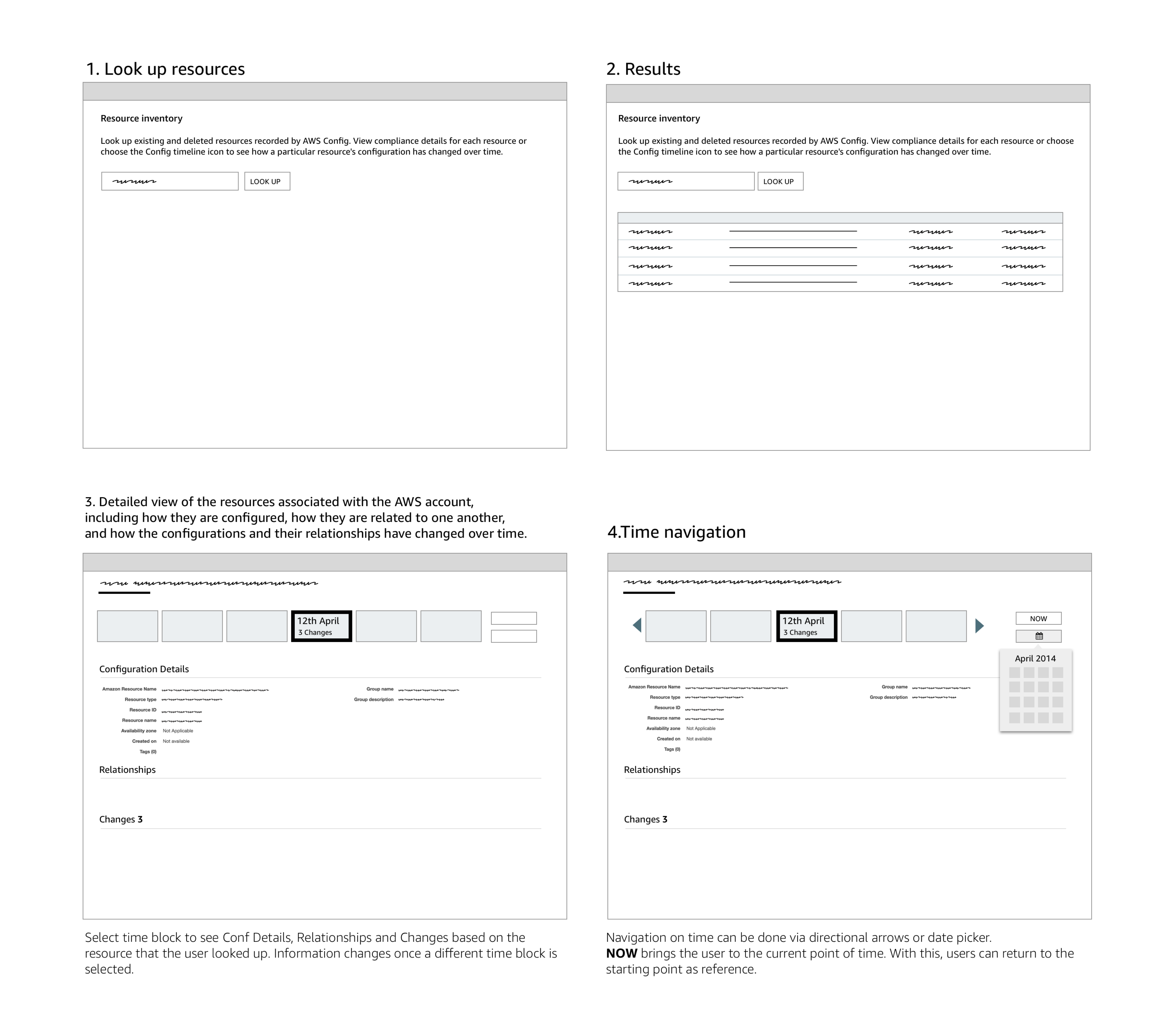
TASK WIREFRAMES
I use Tasks Wireframes constantly during the early phase of prototyping because it helps to present the flow and interactions of the design without spending time developing an interactive prototype. Each task is explained so stakeholders can review and comment on the design. After the wireframe is approved then I start working on a high-fi prototype where developers can visualize and interact with the design.
So this is AWS Config...in a nutshell.
PROTOTYPING
Prototyping was the most effective way to gain meaningful feedback from the team, consensus from stakeholders and approval from senior leadership. I was able to easily distribute these as videos and recycle them for Usability Testing.
For the TimeLine prototype I decided to use Axure RP to show the design and interaction of the idea. One of the main reasons why I decided to use Axure to develop the prototype was the limit of time that I had to transform the idea into a playable artifact.
One problem that I had to face as a result of using Axure for developing the prototype consisted of the animation limitations of the tool. It was complicated to match the effect that we were looking for when navigating through pages using the direction controls.
HTML to the rescue!
If you're building a prototype for the web, it makes sense to build it in its natural environment as it provides as real an experience as you can hope to achieve. Understanding how to build your designs can also give you a greater affinity with developers; they'll be more open to your ideas and able to communicate theirs better too.
It also has the benefit that you can take full advantage of all the web has to offer. Your prototype can adapt to the width of the browser window but a graphic wireframe can't. This is useful when demonstrating how your site adapts at different screen widths.
STORY OF A TIMELINE
The different iterations based on user feedback
1. Just request and we do the rest
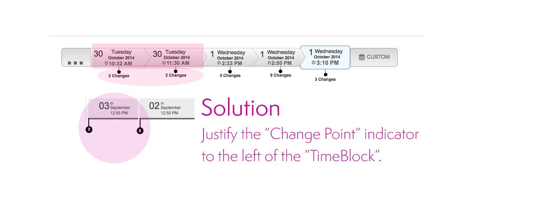
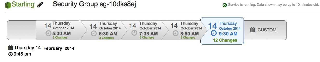
Again, one the of the most critical UI pieces of AWS Consists of the Timeline. We had to make sure that users would understand the time navigation concept.
I was surprised by the issues we found testing the first concept. The main problem consisted of locating the "changes point" indicators on the timeline.
We wanted to make sure that users understand that changes happen at the beginning of a period of time. As a result, if the "Change Point" is in the middle of the "timeblock", it creates confusion to users regarding when the change occurred.
Solution. We justified the "Change Point" marker to the left. Even though that it seems like a complex concept, users did understand the meaning having the indicator of the changes in the left position on the "TimeBlock".
“...the information seems to be too clustered.”
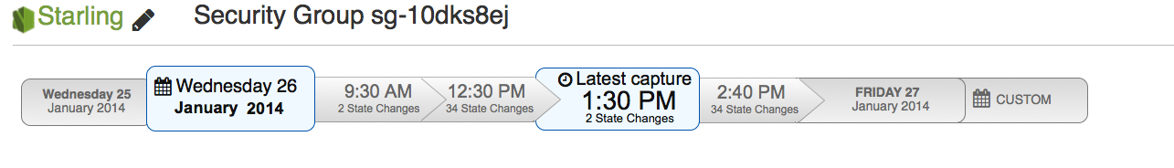
2. We've got your back
The next design shows another variation of the TimeLine. For this case, we display all the possible information inside a "block time", including the number of changes.
The problem with grouping all the information raises the difficulty of users to scan for a determined type of information. “The information seems to be too clustered.”
“...is this a flowchart?.”
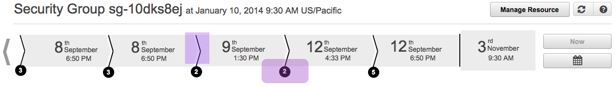
3. Starting Point
Another concept that displays a starting and ending point with the changes in the middle.
Adding a starting point to the time line creates confusion to users. The position of the starting point may vary. As a result, the interaction generates a continuous “jumping around” effect that disorients the user.
The solution is to position the starting point always at beginning of the time line (Left side).
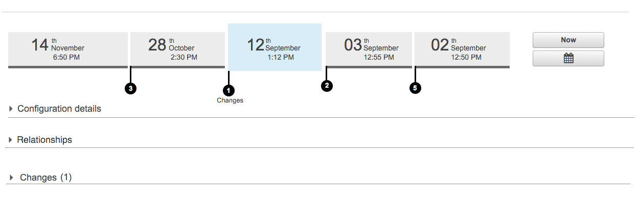
4. Goodbye flowchart
New approach in the design. This look eliminates the "flowchart" feeling from the previous designs.
The arrows on the "TimeBlocks" produces a "flowchart" effect rather than a time line feeling. In addition, the direction of the arrows gives the wrong information about the direction of the timeline. In our case, we want to represent that time starts from left to right.
Also, circles with a number represent the number of changes. The change helps to separate the two most important pieces of information, Time and Changes.
Discoverability is an issue in this design. Many users did not understand what the number inside the circle represents. They need to mouse over to see the "Changes" label.
...and the winner is...
Final version presented at Re:invent 2014
Several visual design improvements help to obtain positive feedback from users. ready to test!
The Discovery
USER RESOURCES CHANGED OVER TIME
“Traveling on time revealed an opportunity to perfect the navigation experience.”
Evaluate
We tested the new Starling timeline UI, looking for usability problems. We also talked to participants about what they would use a tool like Starling for, looking for what kind of functionality is needed to solve the users’ real problems.
We had 7 participants, where 4 were already recruited as beta users of AWS Config and the remaining 3 were from our usability panel. 5 out of 7 users managed large AWS installations, while the remaining two had less than 10 instances.
- All participants liked having a visual timeline to navigate the data.
- All participants navigated the timeline well.
- Starling was thought particularly useful for reverse lookups, such as seeing which instances were associated with which security group or autoscaling group.
Launching is only the Beginning
The UCD Process is circular. New features and improvements start the process again.
"HIGH NOON" situation
One of the main purpose of the AWS Config console is to allow users to navigate through time in order to be able to search, browse and analyze data. At that point in time, AWS lacked a control to allow the customer to navigate in time. The only control in the UI library close to what I was looking for consisted of a date picker control.
One big UI challenge that I have to face consisted of figuring out how to allow users to navigate between dates.
As a result, the biggest challenge for this project consisted of convincing leadership that the use of a timeline is the correct approach to solve the navigation between dates.
Skepticism was one of the biggest challenges that I faced during the completion of this project.
It was challenging to design a tool for navigating in time without breaking some AWS *UXDG patterns.
What I learned
I am often asked if I am proud of launching AWS Config. I’m partially lying when I say I am. Let me explain why.
One of Amazon’s leadership principles is having a bias‐for‐action. Amazonians are proud to insist that product decisions are reversible and spending time doing is better than overanalyzing.
Throughout this project, I observed how bias‐for‐action mutated into a bias‐for‐delivery. Our team disproportionately focused on measuring outputs, rather than learning and measuring outcomes. This inevitably led to a lot of waste, short‐sightedness, and distraction for the team.
We let the question “how quickly can we build it?” define it, more than we let our customers define it. We let the phrase “let’s just get something out there” define quality, more than we let our customer define quality.
If we had asked “are we building the right thing?” as much as we asked “are we going to meet our date?“, we would have launched a more reliable, intuitive and polished product, sooner.
At the time of launch, I had difficulty accepting the reality of this product, because I knew where all the dead bodies were hidden. I knew which critical features were missing. I knew how much waste was incurred building non‐critical features and inevitably how the performance and reliability of what mattered most were compromised.
My dissatisfaction is not a case of perfectionism, but rather an insistence on quality. Quality that should never be compromised, even in the first version of a product. Quality is the responsibility of an entire group and I have learned that beautiful experiences are only possible if the whole team truly shares the same values and aspirations.
Fast forward to the present, and I feel that my satisfaction and insistence for quality does not seem to matter at all. The success of this product had nothing to do with how I feel, but everything to do with if and how the product is being used.
So, if you ask me if I am I proud of what I launched I would still say no, but I would then tell you that I am very proud of what I accomplished for Amazon. I am proud that the team is in a better position to learn, and that launching this product needed to happen in order to expose how badly things were broken—both in the product and in the way we were working. I believe that great design takes time and wisdom, which is only possible if the entire team is in a position with an accompanying mindset to learn.
Today, thousands of customers are enjoying AWS Config and we are exceeding our business objectives. And while I can’t prove how much the extra mile would have benefited our business, at least the product is not considered done.
Jeff Bezos’ famous saying at Amazon is that “it’s still day‐one”. For AWS Config, this could not be truer.