Accessibility / Mobile / 2024
Visual Interactive Voice Response: turning phone menus into a visual flow.
A first-party VIVR that lets people switch from a support call to a visual interface on their phone — making tasks like product activation easier, faster, and more accessible than navigating a maze of voice prompts.
This portfolio showcases my personal work and design projects. While some content may reference my professional experience at Microsoft, all views, opinions, and designs presented here are my own and do not reflect the official policy or position of Microsoft. Any data or information displayed is either publicly available or has been anonymized to protect confidentiality. This portfolio is intended solely to demonstrate my skills and experience in UX design.
01 / Overview
What it is
Visual Interactive Voice Response (VIVR) is typically used when a customer calls a support number — for example, to activate a Microsoft product, reset a password, or troubleshoot an issue.
Think of VIVR as a smarter, more visual version of the traditional phone-based support system. Instead of navigating a maze of voice prompts ("Press 1 for this, press 2 for that"), VIVR lets users switch from a phone call to a visual interface — usually on their smartphone — via a link sent by SMS. This visual interface helps users complete tasks like product activation more easily and intuitively.
02 / Problem
Expensive to run, hard to change
Microsoft relied on third-party providers to manage and update the VIVR solution, leading to high costs and a cumbersome process for making changes. The primary goals were to reduce costs, increase productivity, and improve the user experience by building a first-party VIVR solution.
03 / Research & insights
Understanding the previous experience
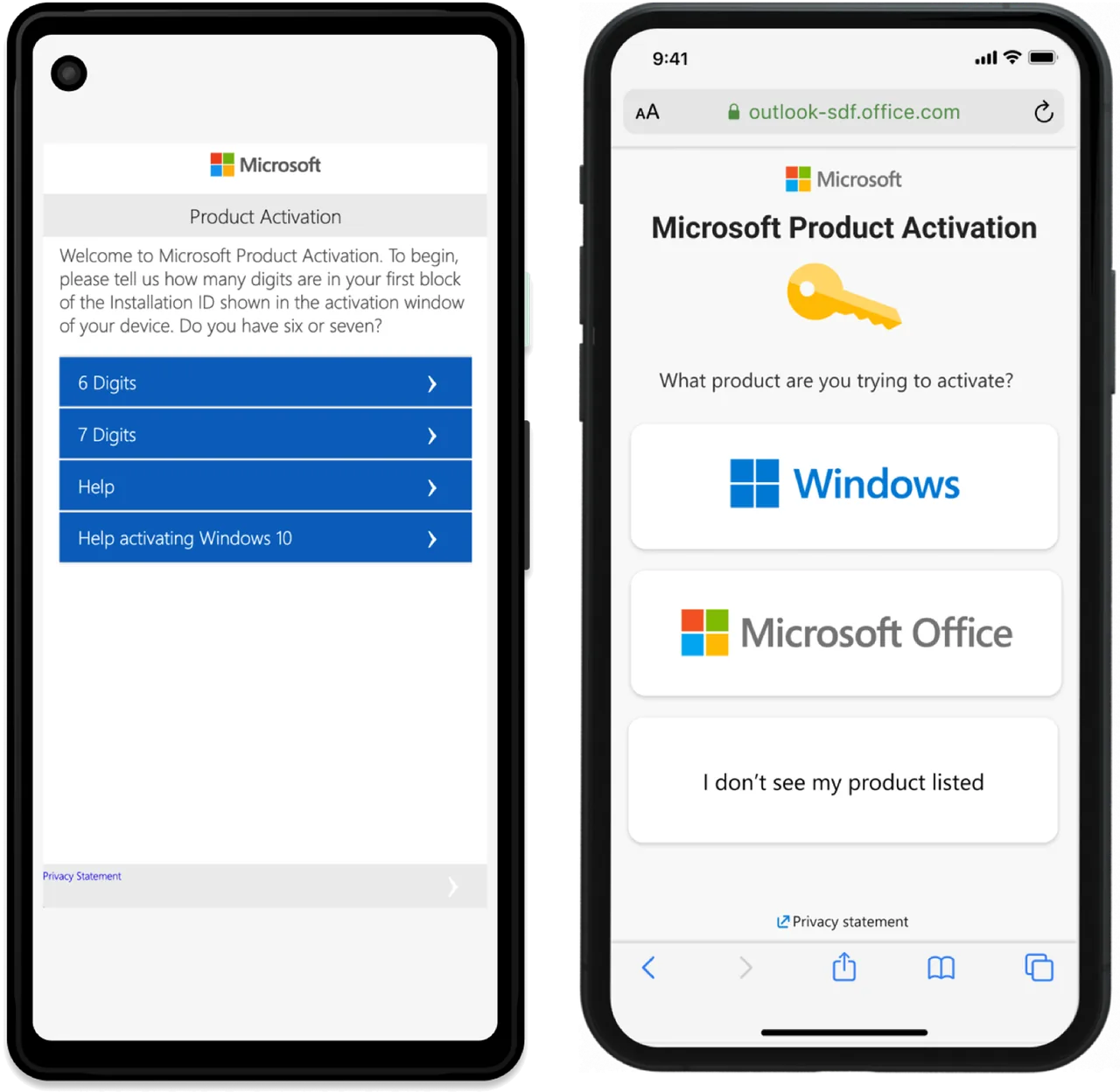
Previous version
I conducted evaluative studies to understand user expectations, behaviors, and pain points when activating a Microsoft product through VIVR. The research included user interviews, usability testing, and analysis of support tickets from the previous implementation. Key findings revealed several challenges:
- Complex navigation: users struggled with the multi-step process and unclear instructions, leading to frequent errors and frustration.
- Lack of guidance: many users felt unsupported during critical steps, especially when troubleshooting activation issues or entering long numeric codes.
- Time-consuming process: the activation flow required significant time, with users often switching between devices and repeating steps.
- Accessibility barriers: the previous design did not adequately support users with hearing, vision, or cognitive impairments.
- Inconsistent experience: differences between the phone-based and visual interfaces made it difficult to complete tasks seamlessly.
These insights informed the redesign — focusing on simplifying the activation journey, providing contextual help, improving accessibility, and ensuring a consistent experience across devices.
04 / Heuristic evaluation
Finding usability flaws systematically
I ran a heuristic evaluation to find usability flaws in the Microsoft product activation mobile experience.
Heuristic Evaluation is one of four user-feedback systems in the UX Health initiative at Microsoft Digital. UX Health gathers consistent qualitative and quantitative insights across products to enable comparison and support a healthier UX portfolio.


05 / Design process
From wireframes to prototypes
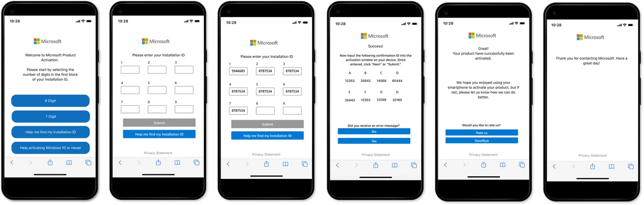
I started by creating initial wireframes based on user research and feedback. These served as the foundation for the prototypes, ensuring the design was user-friendly and met the project goals. After finalizing the wireframes, I moved on to developing initial prototypes.

06 / Prototyping
Making it interactive
The prototypes provided a visual representation of the VIVR solution, letting users interact with the design and give feedback. They were built in Axure RP to keep the design consistent and aligned with user needs.
07 / Testing
Listening to participants
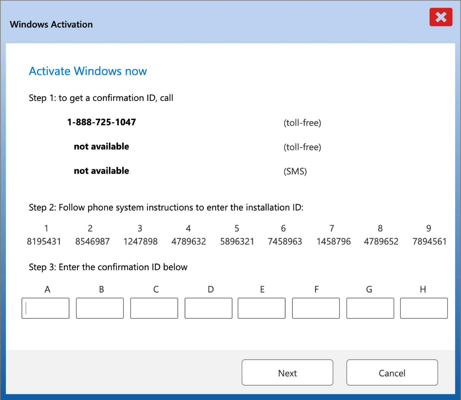
Usability tests run by the User Research team evaluated the effectiveness of the VIVR solution, gathering feedback on the initial desktop and phone experiences.
"Going back and forth between the computer and the Visual Interactive Voice Response phone experience is confusing."
Usability test participant
- There are too many numbers: participants said there were too many numbers to enter across the desktop and VIVR phone experience. They felt confused and worried about making mistakes when typing activation codes.
- "Help find my installation ID" wasn't helpful: participants wanted more options when seeking help within VIVR. They were required to go through troubleshooting first, and only then were directed to the product key.
- Switching devices is confusing: participants felt the VIVR phone experience and the computer experience didn't feel integrated, making the hand-off jarring.
08 / Results
A cheaper, smoother, more accessible flow
100%
First-party solution.
50%
Reduced activation time.
WCAG
Accessibility compliant.
↓
Support tickets reduced.
The VIVR solution shipped successfully, letting users activate their products through a visual interface. Building it first-party reduced costs by eliminating reliance on third-party providers and improved productivity by streamlining how changes are made.
Users reported a smoother, more efficient activation process with fewer issues and a reduced time commitment. The visual design earned positive feedback for its modern, accessible approach — catering to users who require hearing or speaking assistance.
More case studies
All work
Microsoft Learn Advisor
AI learningPersonalized learning paths shaped by a learner's goals and preferences.

Designetica
AI productTurning interface references into clean, semantic HTML with AI vision.
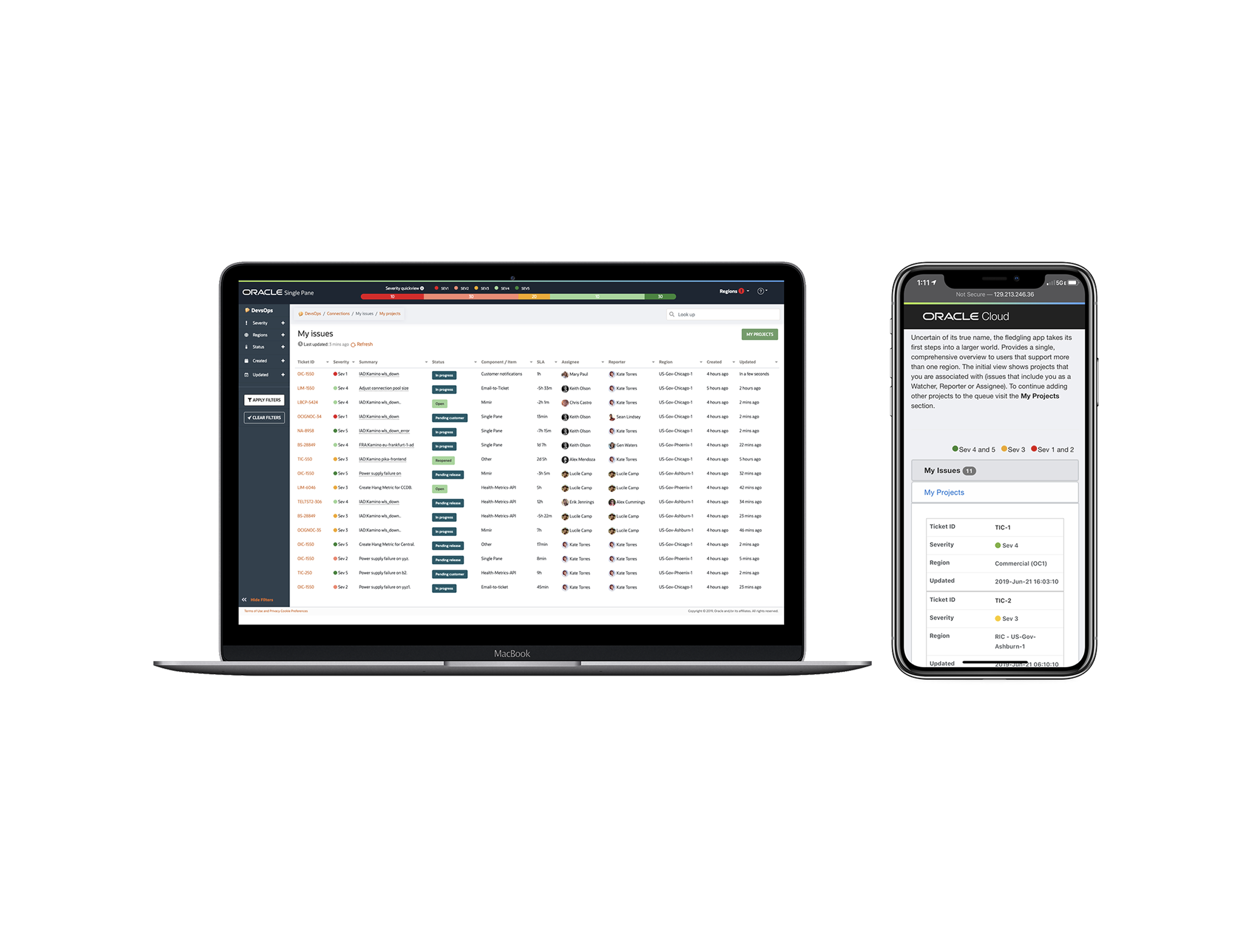
Oracle Single Pane
Cloud operationsA unified workspace for managing many service instances without parallel tabs.