Cloud operations / Web and mobile / 2022
Oracle Single Pane: one view for many Jira instances.
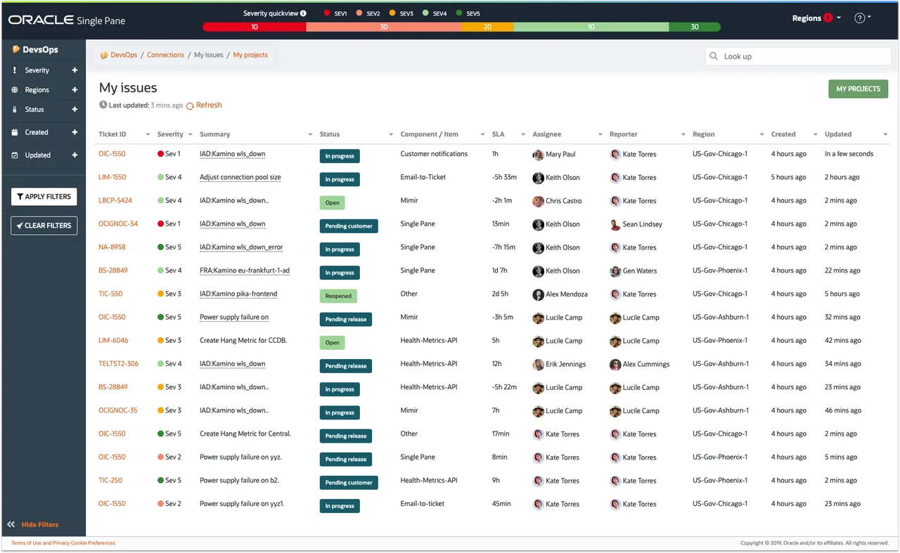
A consolidated, read-only workspace that lets OCI engineers monitor Jira Service Desk tickets across every realm and region from a single interface — no more a tab per region, no more missed tickets.
This portfolio showcases my personal work and design projects. While some content may reference my professional experience at Oracle, all views, opinions, and designs presented here are my own and do not reflect the official policy or position of Oracle. Any data or information displayed is either publicly available or has been anonymized to protect confidentiality. This portfolio is intended solely to demonstrate my skills and experience in UX design.
01 / Overview
What it is
Single Pane lets you view multiple Jira Service Desk instances within a single user interface.
Gone are the days of keeping a separate tab open for each region. Single Pane consolidates issues from remote Cloud and Server Jiras into one place, so engineers can monitor system health without constant context switching.
02 / My role
Sole designer on an Agile team
I was the sole UX designer on an Agile team of three developers and a product owner. I was responsible for the overall design direction, while collaborating with the team on ideation. My work spanned:
- Product strategy.
- User research & analysis.
- User flows & stories.
- Persona creation.
- UI design & prototyping.
- Usability testing.
03 / Problem
Monitoring many systems at once
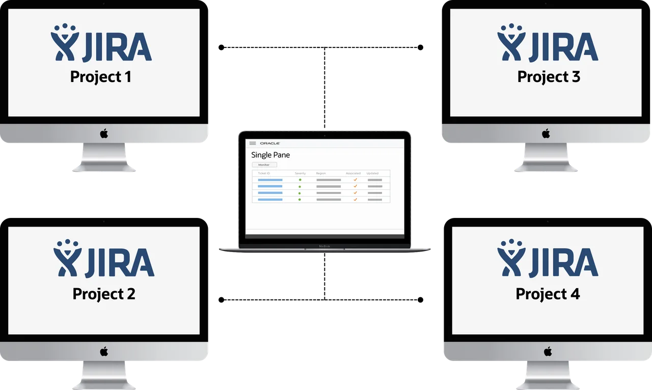
Ideally, engineers could manage tickets in a single system; however, requirements prohibit this. Engineers must review multiple Jira instances to monitor their system health.
- A history of missed tickets from monitoring multiple systems.
- An inability to correlate related issues across regions.
- Lowered customer satisfaction from slow engineer response on in-progress tickets.
04 / Goal
One place for daily Jira tasks
To reduce or eliminate these issues, Oracle Single Pane provides a single place for OCI users to perform read-only Jira Service Desk tasks daily, independent of realm or region. Consolidating remote Cloud and Server Jiras into one interface decreases missed tickets and increases customer satisfaction by reducing response time on in-progress tickets.
05 / Research & insights
Watching engineers work
The first step was to talk to engineers and understand the environment they work in and their needs. Before building user scenarios, stories, and personas, we needed to see how users reacted to the current experience. We asked about a dozen OCI engineers to follow tickets while we observed their behavior, and how they felt about each page or action required to follow active Jira tickets.
The interviews surfaced the common pains of a multi-Jira setup:
- Focus on one view to avoid context switching.
- No alert when tickets are created.
- The current flow does not support multiple regions.
- A lack of cross-references between issues in different Jira sources.
- No mobile version.
These key insights defined the launch of the MVP version of Single Pane:
- The current flow does not support multiple regions.
- Users need information to be highly scannable and simple to navigate.
- Information overload affects users monitoring multiple systems at once.
- One dashboard per region means up to six tabs open at a time.
"You have to update the 6 dashboards at the same time to keep them synchronized."
OCI engineer
06 / User stories & flow
Mapping the needs
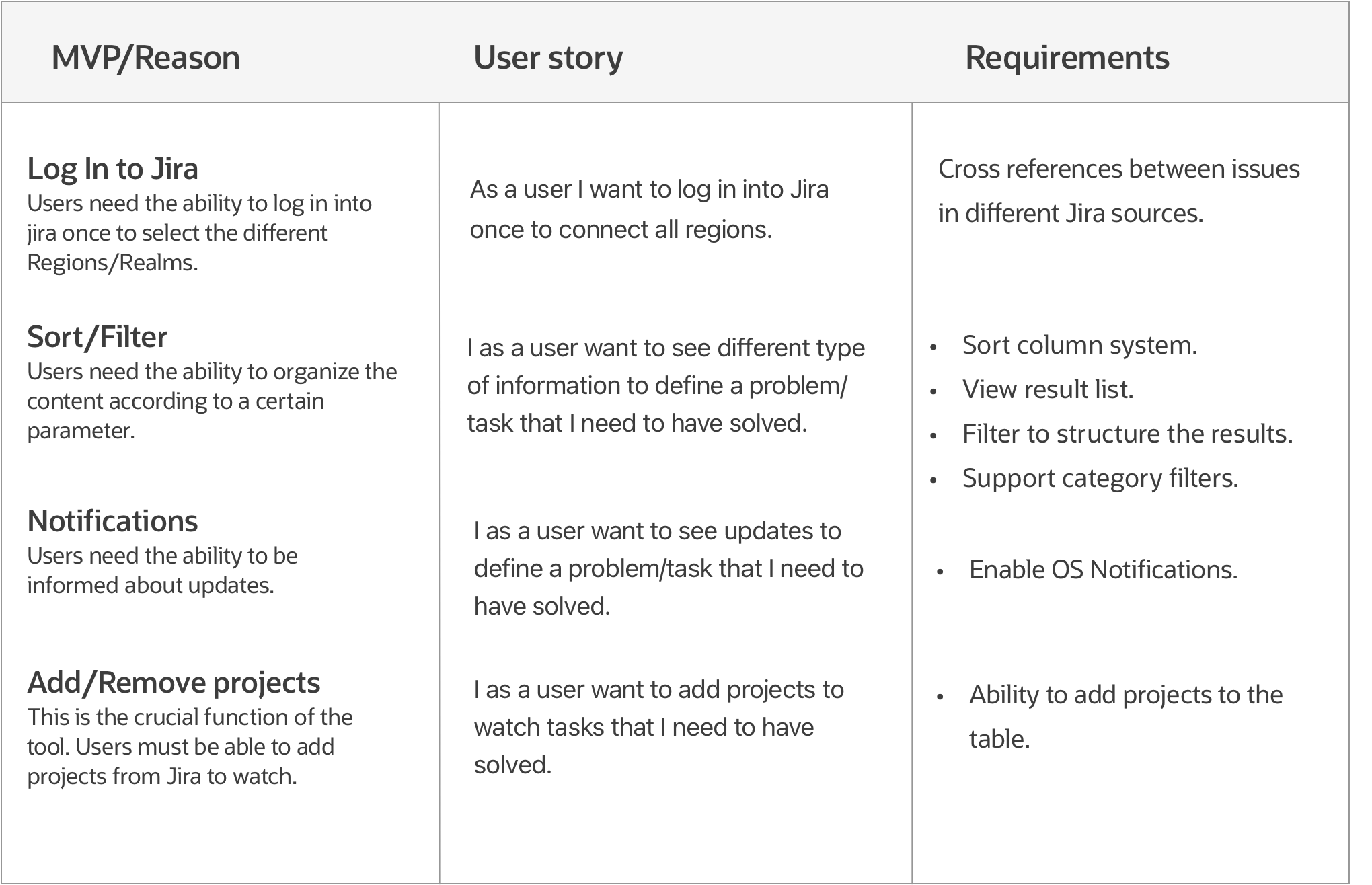
User research and persona creation surfaced users' main needs, goals, and behaviors. The main issues my design decisions needed to solve were:
- Focus on one board to avoid context switching.
- Alerts and notifications.
- The ability to filter & sort data.
- The ability to manipulate data (add and remove).
Next, I created a user flow diagram to map every step of the interaction required to achieve the tool's main goal: consolidating issues from Server Jiras into one view.

07 / Designing the tool
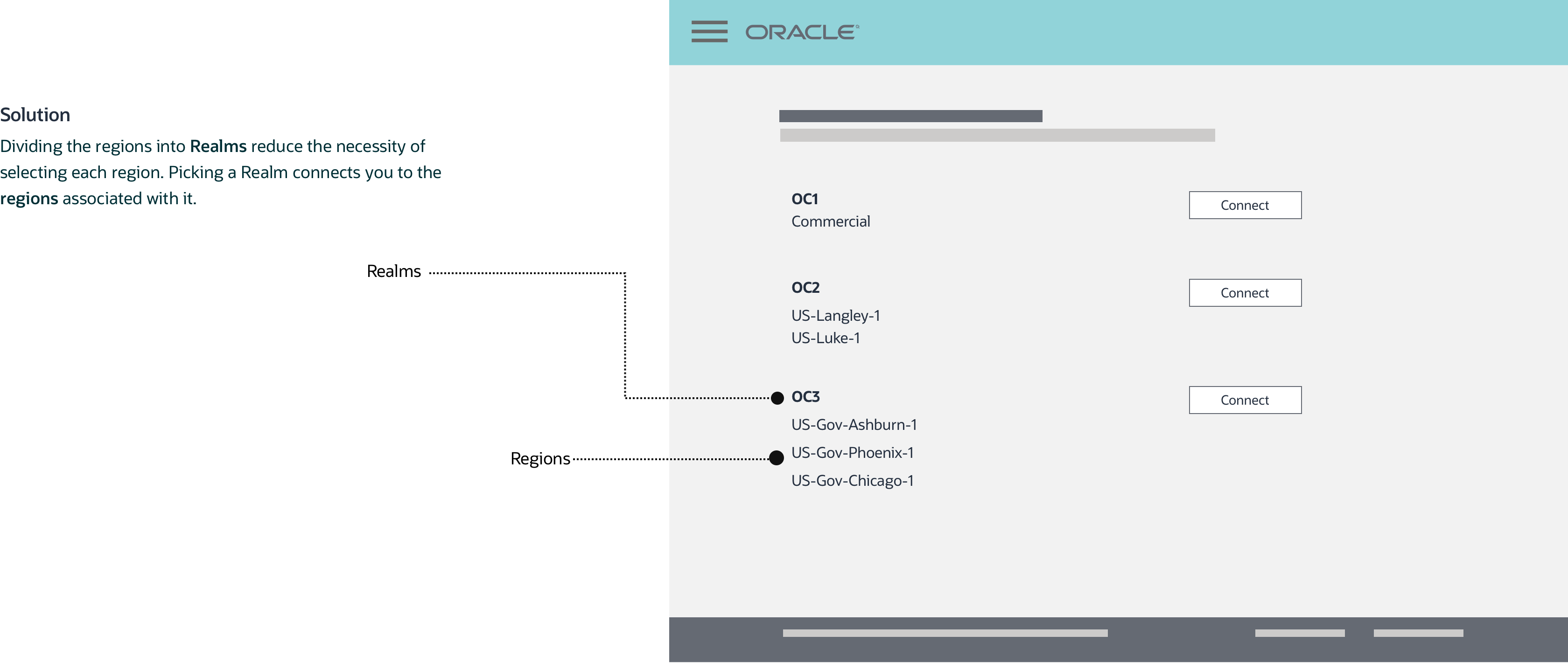
Connecting to regions — a challenge
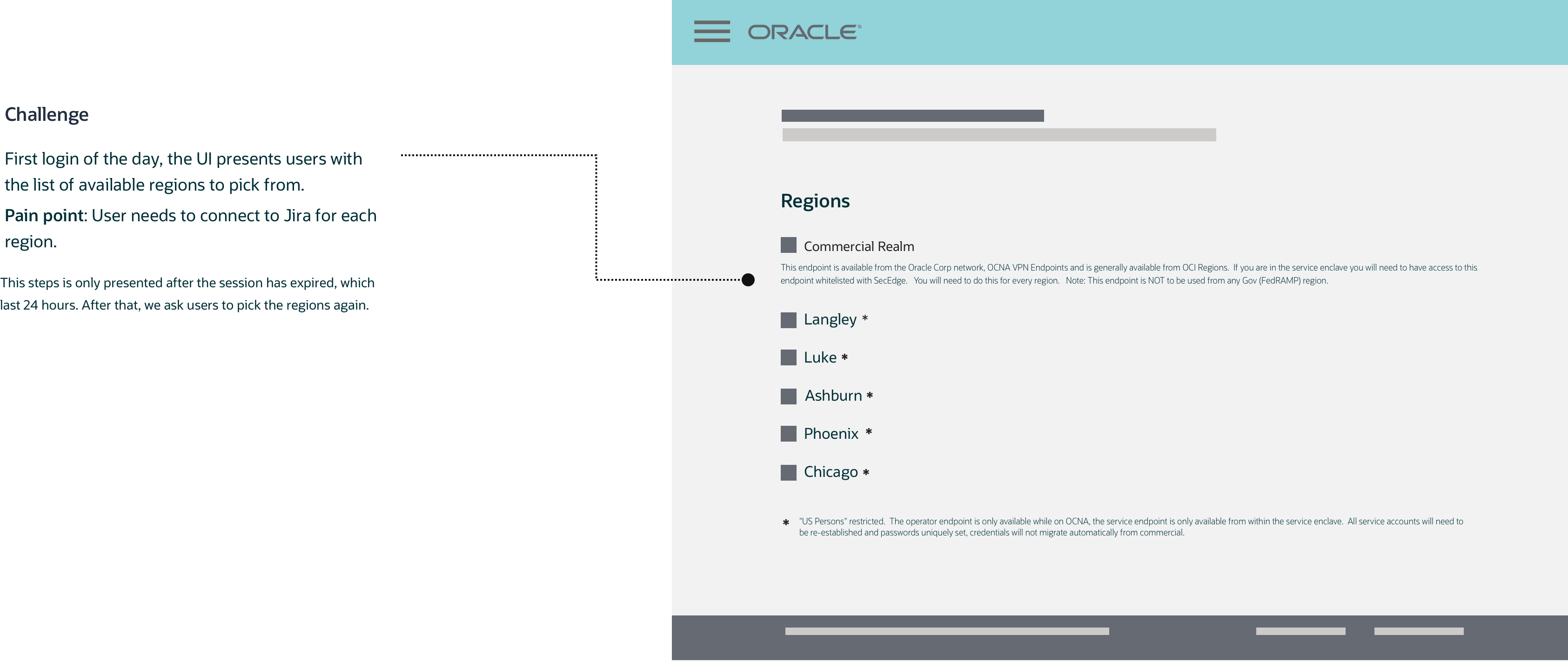
Solution
Dividing regions into realms reduces the need to select each region individually. Picking a realm connects you to its associated regions, and users can connect manually if one region fails. If a user isn't interested in a region, they don't need to do anything about it.
- OC3 (realm)
- Ashburn (region)
- Phoenix (region)
- Chicago (region)
08 / Filtering & sorting
The hardest part of the experience
Filtering and sorting was the hardest section of the platform in terms of experience and design.

First round: filter bar
For the first round, given the number of records to filter by, I added a filter bar built as an expandable panel. Users click the different options to filter by the category presented.
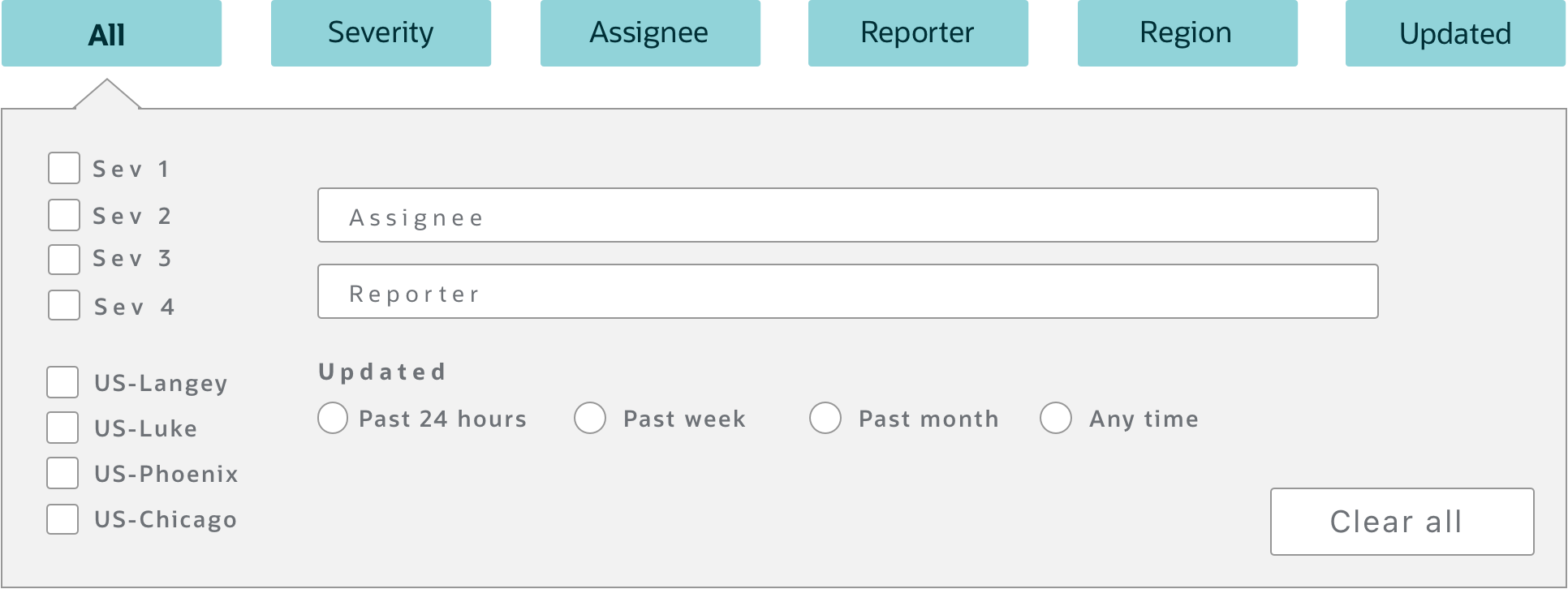
For a better testing experience, I coded the idea so I could better measure user reactions when interacting with the filtering proposal.
The feedback on the experience was negative. Users didn't understand how to interact with the filter bar. The multiple buttons created an overwhelming experience (Hick's Law), and the amount of space filtering took up on the page wasn't welcome. Participants were looking for something more traditional.
"Too many buttons…"
OCI engineer
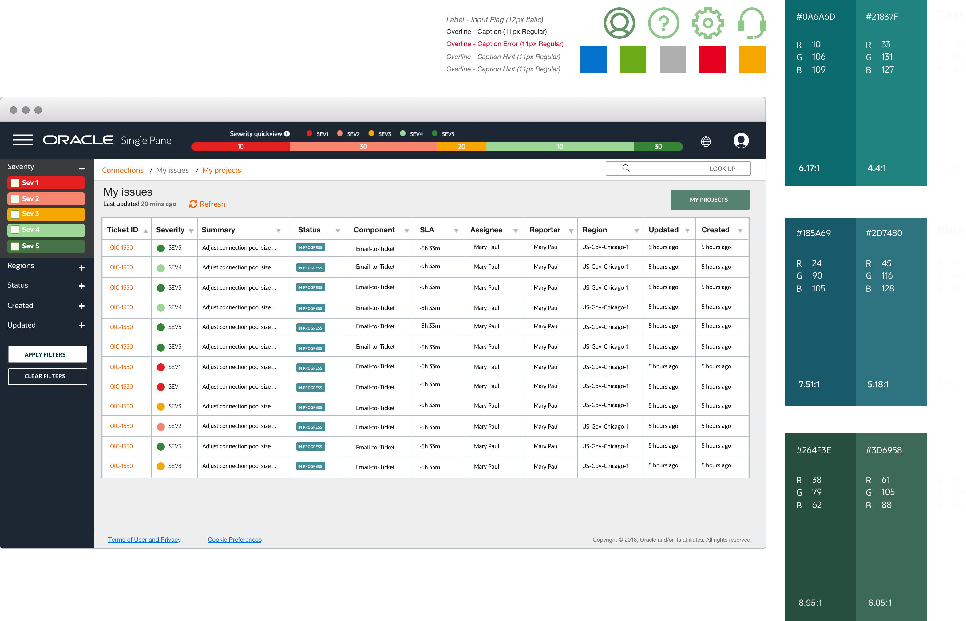
Second round: faceted navigation
Faceted navigation provides multiple filters — one for each aspect of the content — and is more useful for large content sets. Because it exposes the different values in the data, it also reveals a structure that helps users understand the content space and see what's available.

Again, I coded the idea for testing. Participants felt more comfortable with faceted navigation — the feedback included satisfaction with navigating and selecting multiple data values, and the layout was well received during filtering tasks. Other suggestions included being able to close the filtering section when not needed and to reset selected filters.
09 / Interface design
Specs for engineering
I created sets of specification docs to communicate requirements to engineering. These deliverables consisted of customer journeys and the design system — informing typography, attributes, size rules, button sizing and behaviors, hierarchical content organization, iconography, measurements, spacing, and styles for all patterns.
10 / Validation
Usability testing the first release
The new approach eliminated the "flowchart" feeling of previous designs. Earlier, arrows on the time blocks produced a flowchart effect rather than a timeline, and the arrow direction implied the wrong reading order — we wanted to represent time moving left to right.
Circles with a number represented the number of changes, separating the two most important pieces of information: time and changes. Discoverability was an issue, though — many users didn't understand what the number inside the circle meant and had to hover to see the "Changes" label.
The goals of the test were to:
- Evaluate whether OCI engineers can complete key tasks within an optimal success rate.
- Identify whether key patterns are missing in the interaction flow.
- Determine whether users exhibit anxiety, confusion, or frustration during their journey.
The HTML prototype exposed usability issues straight away. The process became less time-consuming because small changes no longer took hours to rectify, and the code was completely reusable when it came to the production stage.

11 / Responsive design
Fluid across screen sizes
The design was created to be responsive — fluid and adaptive to the screen size. Rather than a "mobile first" design, it's a "responsive first" design: not built for one specific screen size, but to adapt to any.

12 / MVP & next steps
Shipping and learning
83%
Reduction in context switching.
6→1
Tabs consolidated into a single view.
40%
Faster ticket response time.
5+
Teams onboarded at launch.
The goal was to release a tool that eases the burden for on-calls by providing a consolidated view of multiple Jira Service Desk instances. We wanted to onboard multiple teams, then request feedback and review metrics to learn about the tool's performance before moving to the next implementation.
Learnings & next steps after the MVP release
The main problem was users expecting an overview of the data (data visualization). Technical constraints meant we had to substitute pagination for infinite scrolling — which still impacted record navigation.
Next steps were to test the live implementation with users, investigate an alert system, and explore data pagination. I also explored how to add more value to the data visualization by making it more informative, interactive, and engaging.
More case studies
All work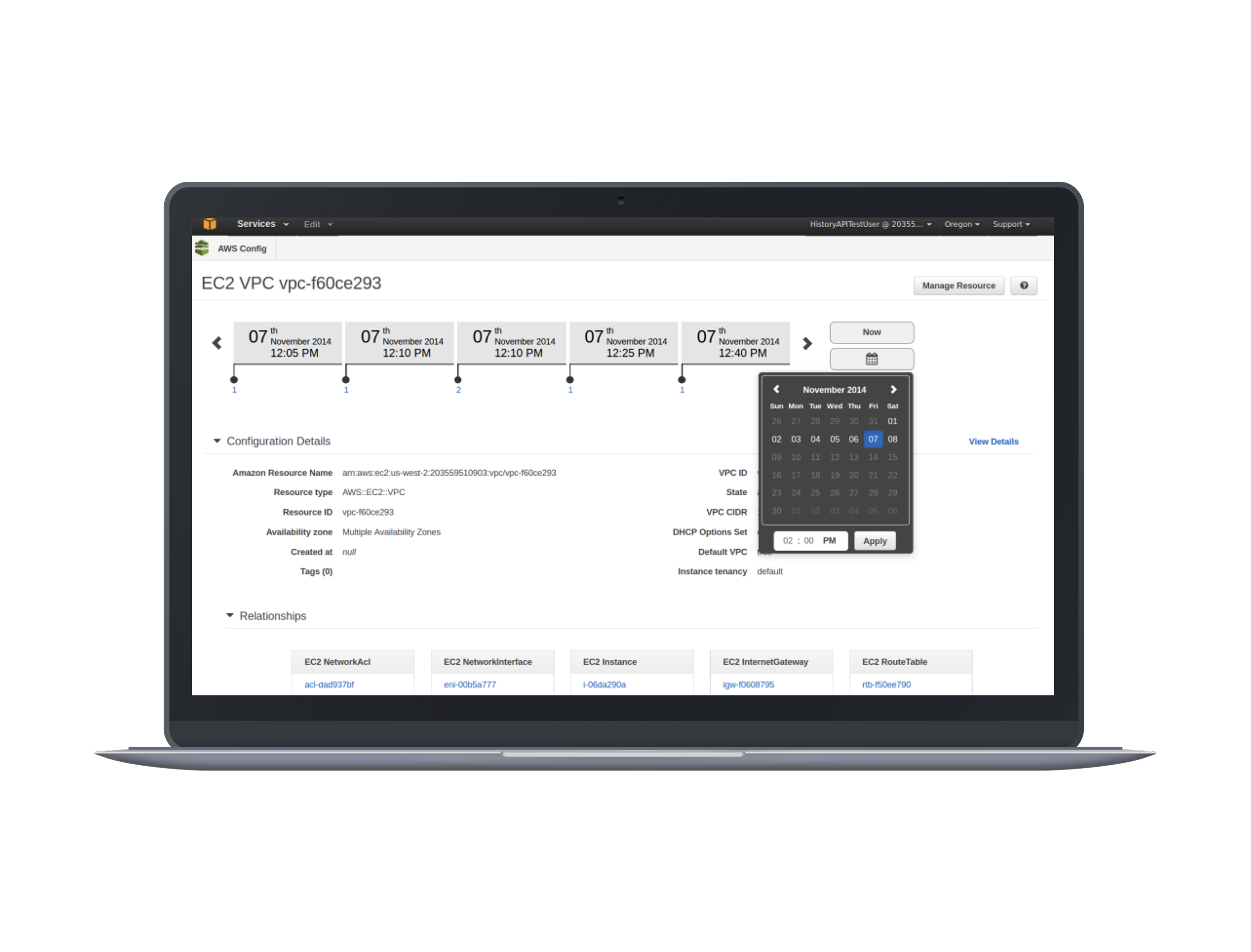
Building AWS Config
Cloud infrastructureAssessing and auditing configuration changes across cloud resources over time.
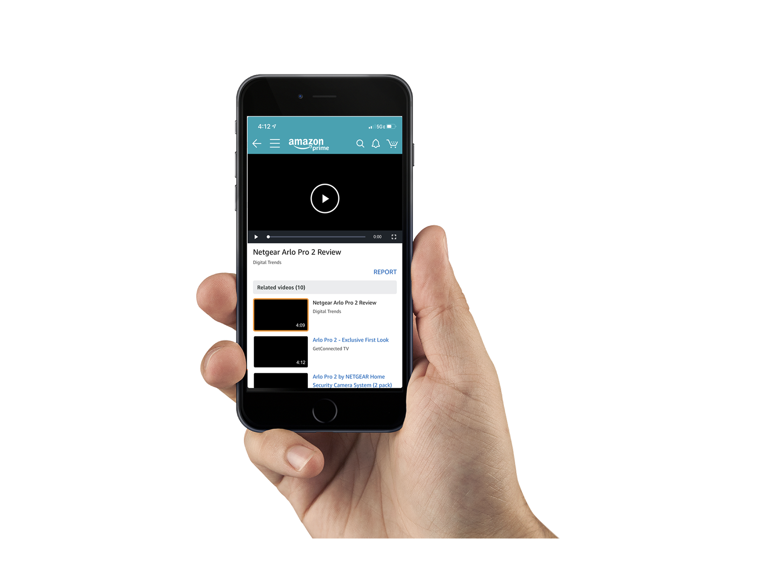
Mobile Video Lightbox
CommerceA way to browse and discover video content directly within the shopping experience.

Designetica
AI productTurning interface references into clean, semantic HTML with AI vision.