

Building AWS Config
This portfolio showcases my personal work and design projects. While some of the content may reference my professional experience at AWS, all views, opinions, and designs presented here are my own and do not reflect the official policy or position of AWS. Any data or information displayed is either publicly available or has been anonymized to protect confidentiality. This portfolio is intended solely for the purpose of demonstrating my skills and experience in UX design.
AWS Config was the first product in a new line of AWS cloud computing tools designed to assess, audit, and evaluate the configurations of your AWS resources.
Imagine This...
Once upon a time, there was a kid named Alex who had a big toy room. Every day, Alex played with toys, moved them around, and sometimes even gave some away or got new ones.
But Alex’s mom wanted to keep track of what toys were in the room and what changed every day. So she got a magic notebook called AWS Config.
What the Magic Notebook (AWS Config) Does
These were AI-generated customized plans—smart guides that Every time Alex:
- Took a toy out,
- Put a new toy in,
- Gave a toy to a friend
- GOr changed where a toy was,
…the magic notebook would write it down with the date and time.
So if one day a toy was missing, Alex’s mom could look at the notebook and say: “Aha! On Tuesday at 3 PM, Alex moved the red fire truck under the bed!”
The four month sprint to launch AWS Config
Based on a series of interviews and user surveys with AWS customers, there was a strong demand for a monitoring and evaluation service that continuously tracks AWS resource configurations and automates the assessment of these configurations against desired standards.
My goal for this project was to design the entire new AWS Config console from beginning to end prior to its release during reInvent.
The following content shows some of the qualitative data obtained during the interviews regarding user's needs.
- AWS customers wish to have a tool that discovers AWS resources that exist within his account at any point in time.
- Have a visual way to see how changes occurs in the pass.
- Many customers had difficulty keeping track of and localizing resources changes over time when using AWS.
- Be able to troubleshoot why a resource may have stopped working properly.
In the real world, people use AWS Config to track changes in their computers in the cloud (like servers, databases, etc.). Just like Alex’s toy room, they want to know:
- What changed?
- When did it change?
- Who changed it?
...And the timeline helps them see the story of those changes so they can fix problems or understand what happened.
My role
- Conduct research: Research potential users to find out what their goals and needs are in order to determine product value.
- Collaborate across disciplines: Leading - 1 hour Design Studio. This workshop gathers various team members into a room to sketch solutions around a single focused scenario and a prioritized set of features. The goal is to uncover use cases, gather ideas, and provide insight to other team members to make planning smoother.
- Deliver design decisions: Led the team through a thoughtful and meaningful process making incremental design decisions along the way. These decisions are delivered in many forms such as a conversation, sketch, whiteboard session, wireframe, detailed mockup, or a prototype.
- Seek feedback: I sought feedback from users and stakeholders constantly sharing my work with fellow design peers and gather feedback.
- Communicate early and often: Being part of a Balanced and Agile team means I communicate with the team as a leader, facilitator, and educator. The team rely on me to lead how the product will act and look, facilitate conversations to gather feedback and educate the team on research findings.
Understanding the user
We began by exploring our assumptions about how potential users discover AWS resources that exist within an account at any point in time. For example, our first reaction was to provide a datepicker control to navigate in time to see changes of configuration. After speaking to our users we would end up finding a better approach.
Next, we wrote questions to prompt the interviewees to tell their story in their words. The intention was to get these people to tell us what was important to them when looking for configuration across different AWS resource types.
The first round of interviews produced a number of distinct clear trends.
- A simple way to navigate in time to see changes.
- Date picker was the wrong UI to look for dates.
- Relationship between details about configurations of every resource and time.
- Visuals will help users to have a clear view of changes.
- Next, I created a provisional persona of a potential user based on PM knowledge and my understanding of the user. This persona was created with assumptions and not fully research-based but it was something that I came back to throughout my project to guide my design decisions and priorities.
As a System Administrator I want to navigate in time to inventory resources that exist in my account, understand current and previous configurations for their resources and evaluate how a configuration change to one resource affects related AWS resources.
What else has AWS tried?
It was challenging to design a tool for navigating in time to see changes without breaking some *UXDG patterns. The first unsuccessful attempt was to use only UXDG components.
The tool used to create the prototype was Axure RP. In order to obtain more accurate feedback from users, I uploaded the Axure RP files to my Amazon personal server. As a result, participants were able to access the prototype from a mobile device providing a very realistic experience to the participants when testing.
Feedback from users suggested investigating another way to allow customers to navigate through time in a more intuitive and aesthetical way.
The responses obtained from users after showing the previous mock stated that using a Date Picker control, to see changes of resources over time, was not the correct solution. Date Pickers consist of input controls where users enter data to obtain a result. The user feels like in an Easter Egg hunting trying to see changes. Contrary, we were looking for a control that helps users to visualize a series of changes over time without entering any input.
Design artifacts
Before I could jump into designing, it was important to define success and understand the requirements.
Due to the complexity of the system I was designing for, creating a task flow helped me represent the logic sequence of the user's flow from the starting point to accomplishing a task.
I use Task Wireframes constantly during the early phase of prototyping because it helps to present the flow and interactions of the design without spending time developing an interactive prototype. Each task is explained so stakeholders can review and comment on the design. After the wireframe is approved then I start working on a high-fi prototype where developers can visualize and interact with the design.
“...how might we help customers navigate through time?”
This begged the question, how might we help customers navigate through time? My proposal was a Timeline.
Prototyping
Prototyping was the most effective way to gain meaningful feedback from the team, consensus from stakeholders and approval from senior leadership. I was able to easily distribute these as videos and recycle them for Usability Testing.
For the prototype I decided to use Axure RP to show the design and interaction of the idea. One of the main reasons why I decided to use Axure to develop the prototype was the limit of time that I had to transform the idea into a playable artifact.
One problem that I had to face as a result of using Axure for developing the prototype consisted of the animation limitations of the tool. It was complicated to match the effect that we were looking for when navigating through pages using the direction controls.
HTML to the rescue!
If you're building a prototype for the web, it makes sense to build it in its natural environment as it provides as real an experience as you can hope to achieve. Understanding how to build your designs can also give you a greater affinity with developers; they'll be more open to your ideas and able to communicate theirs better too.
It also has the benefit that you can take full advantage of all the web has to offer. Your prototype can adapt to the width of the browser window but a graphic wireframe can't. This is useful when demonstrating how your site adapts at different screen widths.
Story of a Timeline
The different iterations based on user feedback
1. Just request and we do the rest
Again, one the of the most critical UI pieces of AWS Consists of the Timeline. We had to make sure that users would understand the time navigation concept..
I was surprised by the issues we found testing the first concept. The main problem consisted of locating the "changes point" indicators on the timeline.
We wanted to make sure that users understand that changes happen at the beginning of a period of time. As a result, if the "Change Point" is in the middle of the "timeblock", it creates confusion to users regarding when the change occurred.
Solution. We justified the "Change Point" marker to the left. Even though that it seems like a complex concept, users did understand the meaning having the indicator of the changes in the left position on the "TimeBlock".
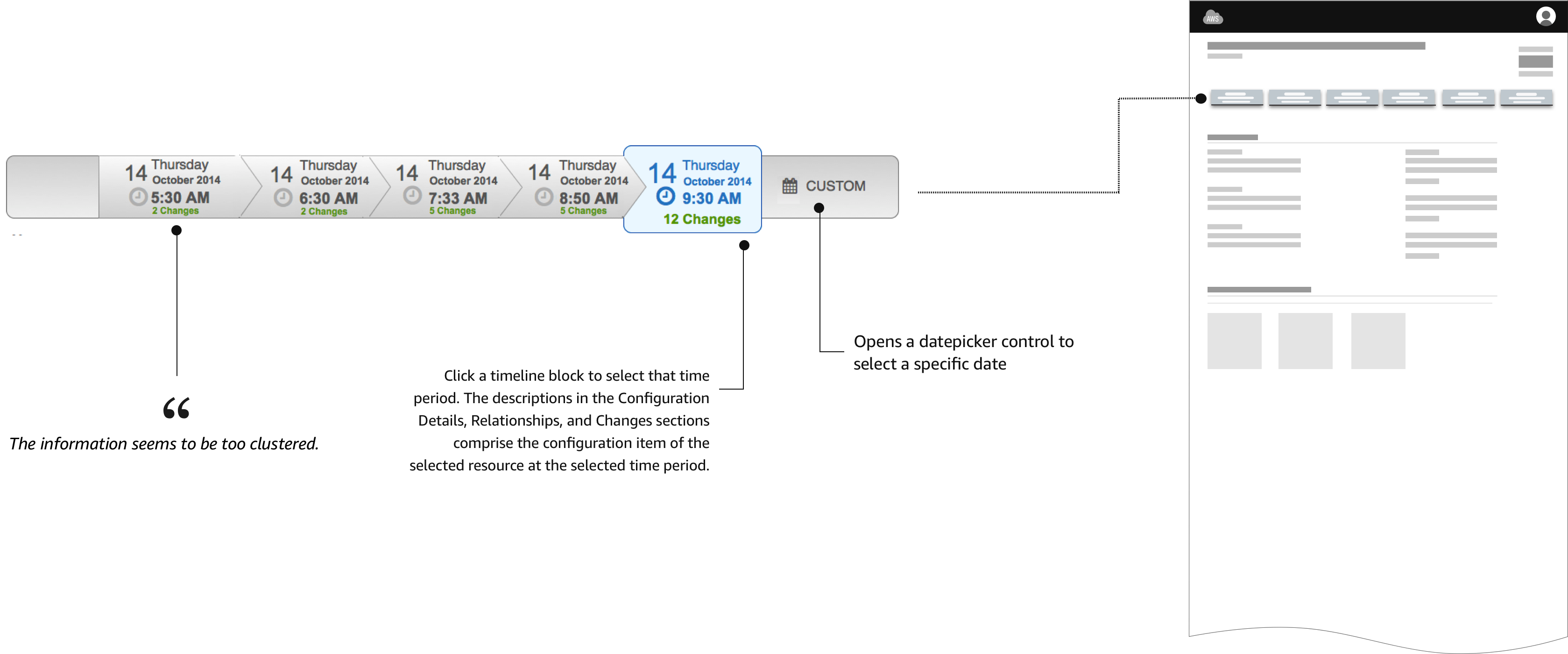
...the information seems to be too clustered.
2. We've got your back
The next design shows another variation of the TimeLine. For this case, we display all the possible information inside a "block time", including the number of changes.
The problem with grouping all the information raises the difficulty of users to scan for a determined type of information.

...is this a flowchart?
3. Starting Point
Another concept that displays a starting and ending point with the changes in the middle. Adding a starting point to the time line creates confusion to users. The position of the starting point may vary. As a result, the interaction generates a continuous “jumping around” effect that disorients the user.
The solution is to position the starting point always at beginning of the time line (Left side).
4. Goodbye flowchart
New approach in the design. This look eliminates the "flowchart" feeling from the previous designs. The arrows on the "TimeBlocks" produces a "flowchart" effect rather than a time line feeling. In addition, the direction of the arrows gives the wrong information about the direction of the timeline. In our case, we want to represent that time starts from left to right.
Also, circles with a number represent the number of changes. The change helps to separate the two most important pieces of information, Time and Changes. Discoverability is an issue in this design. Many users did not understand what the number inside the circle represents. They need to mouse over to see the "Changes" label.

...and the winner is...
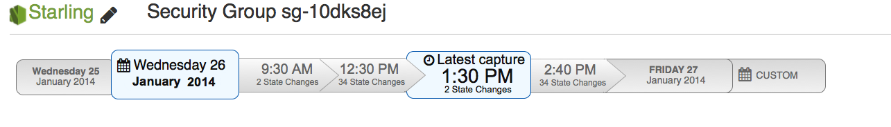
Final version presented at Re:invent 2014
Several visual design improvements help to obtain positive feedback from users. ready to test!
Evaluate
We tested the new AWS Config timeline UI, looking for usability problems. We also talked to participants about what they would use a tool like Starling for, looking for what kind of functionality is needed to solve the users’ real problems.
We had 7 participants, where 4 were already recruited as beta users of AWS Config and the remaining 3 were from our usability panel. 5 out of 7 users managed large AWS installations, while the remaining two had less than 10 instances.
- All participants liked having a visual timeline to navigate the data.
- All participants navigated the timeline well.
- Starling was thought particularly useful for reverse lookups, such as seeing which instances were associated with which security group or autoscaling group.
What the community is saying
Carlos’s design approach has produced one of the most creative consoles for our services.
More case studies
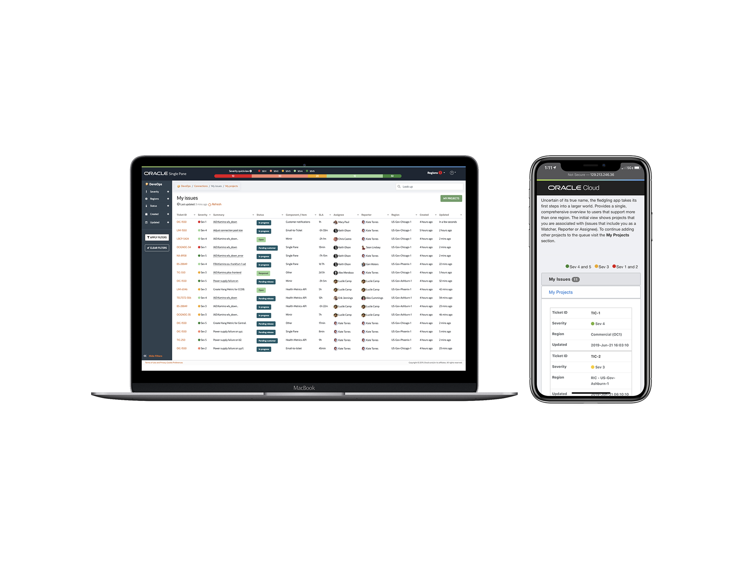
Oracle Single Pane
Single Pane allows you to view multiple Jira SD instances within a single user interface. Gone are the days with a tab for each region(s).
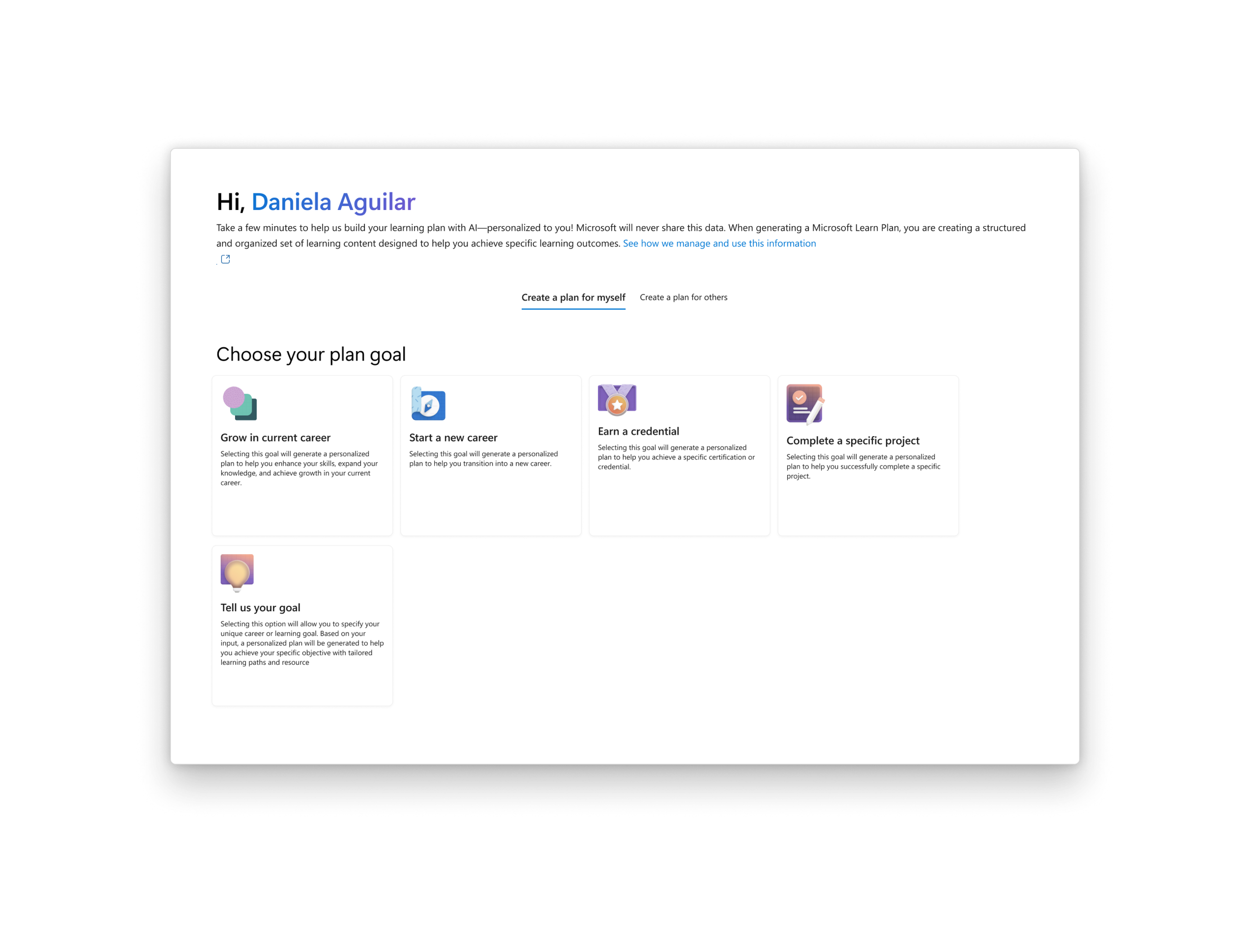
Microsoft Learn Advisor
Microsoft Learn Advisor use AI and your preferences and goals to create learning paths, ensuring you gain relevant skills efficiently.
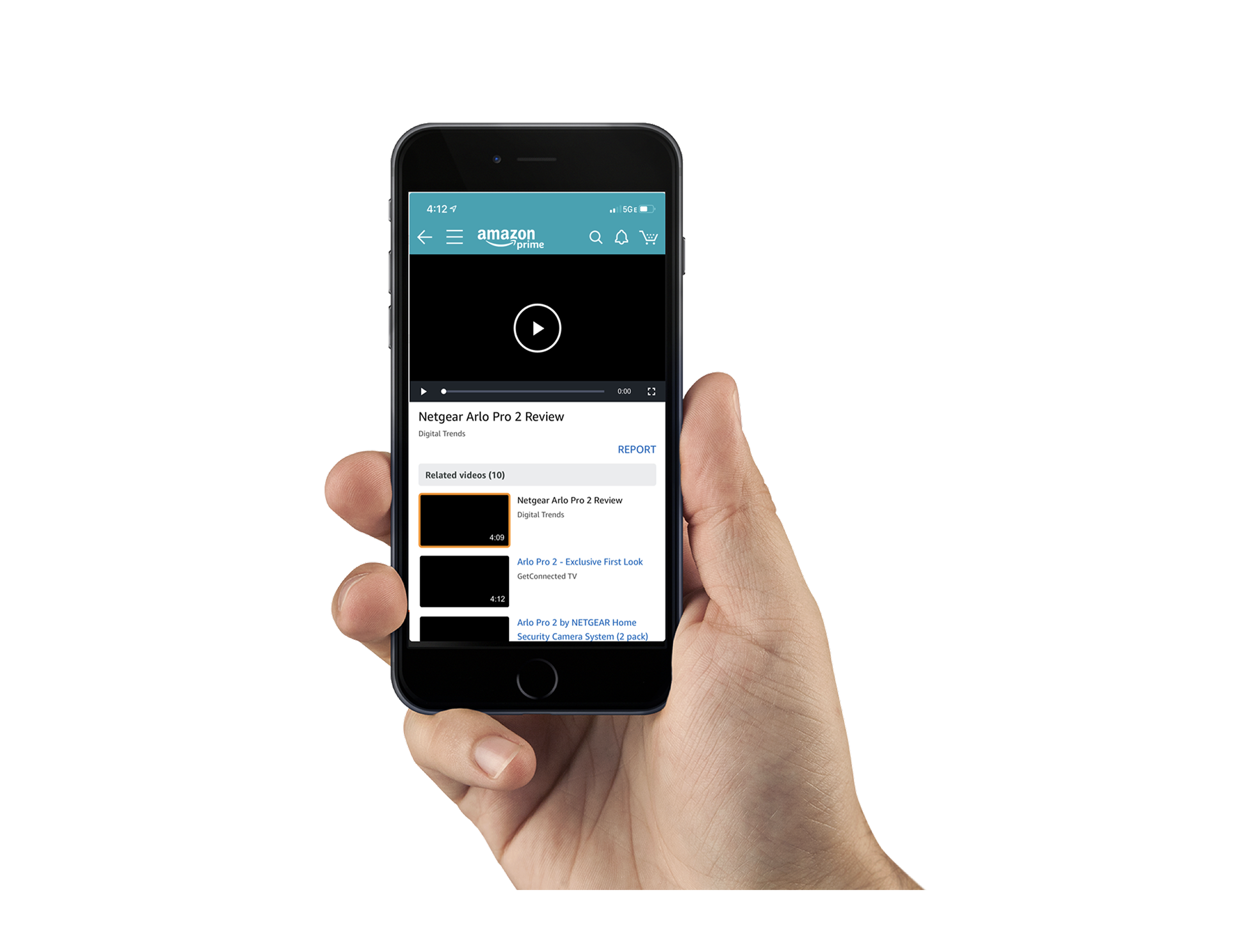
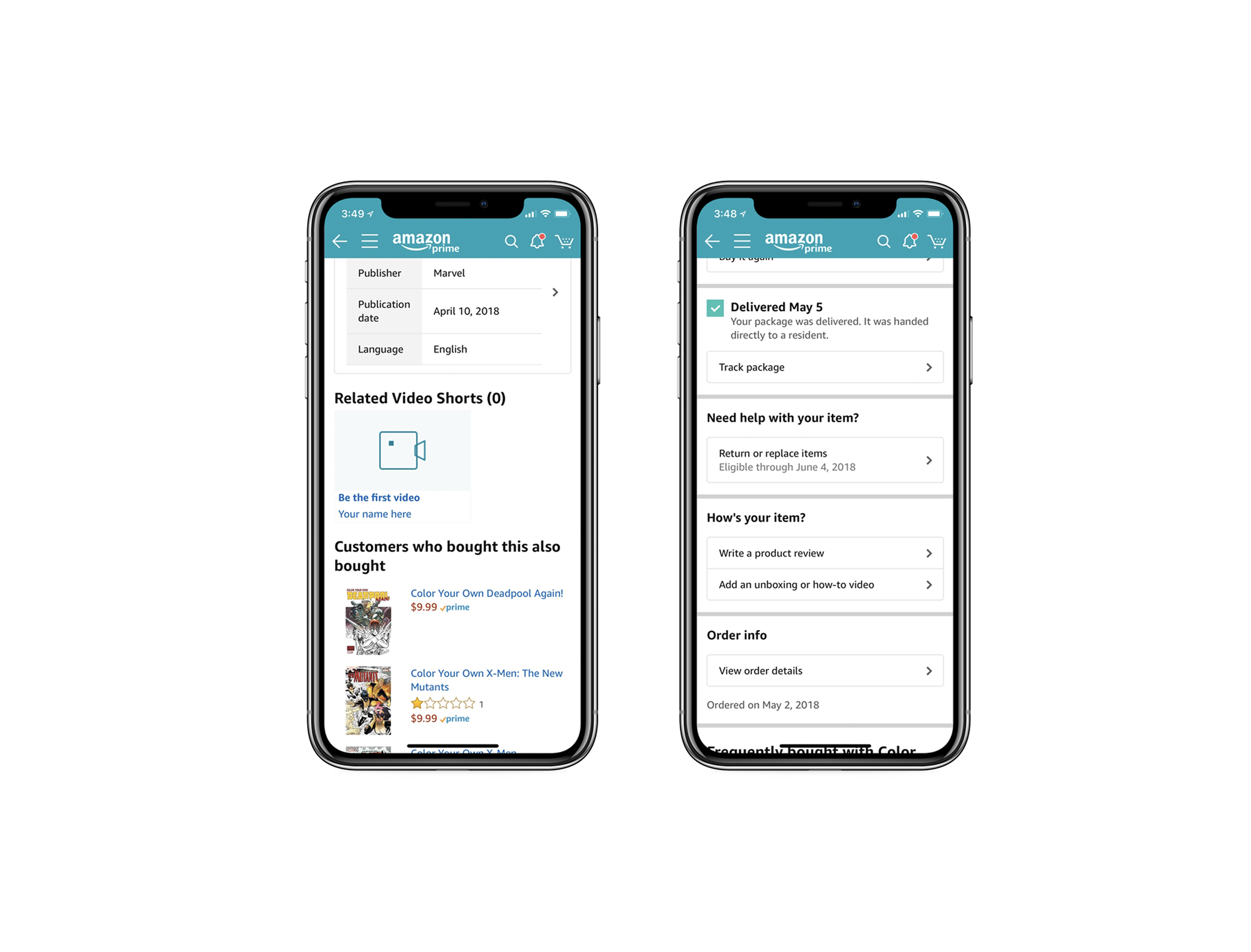
Amazon Video Lightbox
This lightbox serves as a tool to browse, view and discover video content within amazon.com. Both, desktop and mobile versions are available for these purposes.The lightbox control will be used to surface buying guides, recommendations, how-to, product demos, unboxing, and product reviews.
Visual Interactive Voice Response
The Visual Interactive Voice Response is designed to enhance user experience by allowing them to navigate support options visually, which can be more intuitive and accessible, especially for users who require hearing or speaking assistance.
Creator Portal
Amazon customers can now add videos to their favorite products through the Related Video Shorts Widget on Product Detail Pages.