

Building AWS Config
Designing a visual timeline to track cloud resource changes—launched at AWS re:Invent 2014
Role
UX Designer
Timeline
4 Months (2014)
Platform
AWS Console (Web)
Team
1 Designer, 6 Engineers
This portfolio showcases my personal work and design projects. While some of the content may reference my professional experience at AWS, all views, opinions, and designs presented here are my own and do not reflect the official policy or position of AWS. Any data or information displayed is either publicly available or has been anonymized to protect confidentiality.
The Problem
AWS customers had no visibility into their resource configurations or changes over time. When something broke, they couldn't answer: "What changed? When? Who did it?"
The Solution
Design a visual timeline interface that lets users navigate through time, see exactly when configurations changed, and understand the relationships between resources.
Think of it like this...
Imagine you have a big toy room. Every day, you move toys around, give some away, or get new ones. Your mom wants to track what changed.
So she gets a magic notebook that automatically writes down every time you:
AWS Config is that magic notebook—but for cloud servers, databases, and infrastructure.
Results & Impact
My Role
Research
Conducted user interviews to understand goals, needs, and pain points
Workshop Facilitation
Led 1-hour Design Studio sessions with cross-functional teams
Design & Prototype
Created wireframes, mockups, and interactive prototypes
Usability Testing
Ran tests with 7 participants to validate design decisions
Research Insights
We interviewed AWS customers and beta users to understand their needs. Key findings:
What users wanted
- A simple way to navigate through time
- Visual representation of configuration changes
- Understand relationships between resources
- Troubleshoot why something stopped working
What didn't work
- Date pickers felt like "Easter egg hunting"
- Users don't know specific dates of changes
- Input-based navigation was frustrating
- Needed visualization, not data entry
"As a System Administrator, I want to navigate in time to inventory resources, understand configurations, and see how changes affect related AWS resources."
What We Tried First
Our initial approach used standard AWS console components—including a date picker for time navigation. User feedback was clear: this wasn't the right solution.
Design Iterations
The timeline went through 4 major iterations based on user feedback. Each version addressed specific usability issues.
Clustered Information
Problem: Change point indicators in the middle of timeblocks confused users about when changes occurred.
Solution: Justified change markers to the left to show changes happen at the start of a period.
"The information seems too clustered." — Participant
Flowchart Confusion

Problem: Displaying all information inside each timeblock made it hard to scan for specific data.
Solution: Separate time and change information visually.
"Is this a flowchart?" — Participant
Moving Start Point
Problem: Variable starting point position caused a "jumping around" effect that disoriented users.
Solution: Fix the starting point to always appear at the left side of the timeline.
Discoverability Issues

Problem: Removing arrows helped, but numbered circles weren't self-explanatory—users had to hover to understand them.
Solution: Add clearer visual indicators and labeling in the final version.
Final Design
The winning design launched at AWS re:Invent 2014. All 7 usability test participants successfully navigated the timeline.
Prototyping Approach
I used multiple prototyping methods to validate the design quickly:
Axure RP
Interactive prototypes for stakeholder buy-in and initial usability testing.
View Axure PrototypeHTML/CSS
Built native web prototype for realistic animations that Axure couldn't achieve.
View HTML Prototype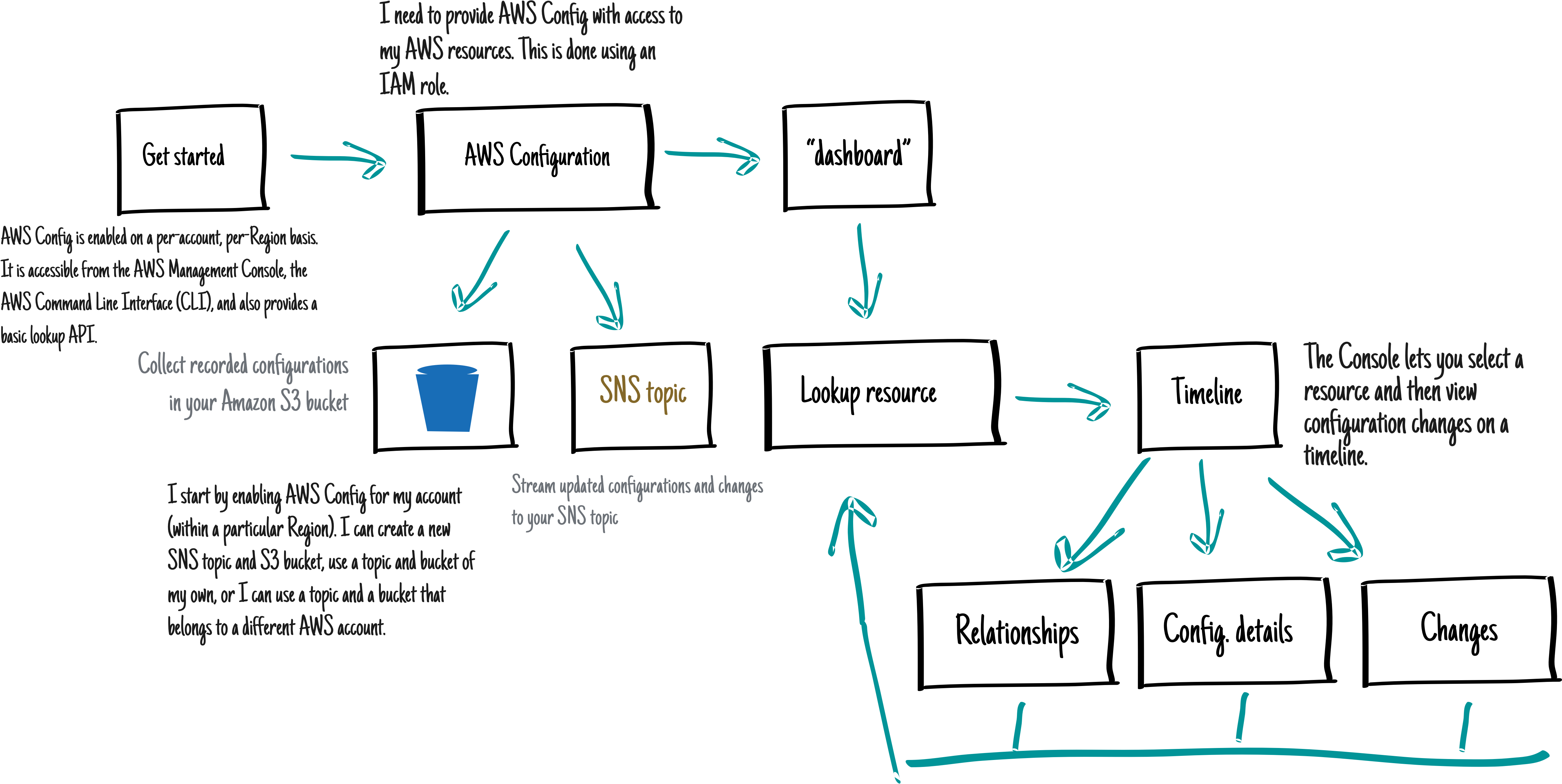
Usability Testing
We tested with 7 participants—4 beta users and 3 from our usability panel. 5 managed large AWS installations.
All participants liked the visual timeline for navigating data
All participants navigated the timeline successfully
Particularly useful for reverse lookups and troubleshooting
"Carlos's design approach has produced one of the most creative consoles for our services."
Community Response
Key Learnings
Challenge conventions
Date pickers are standard—but wrong for this use case. User research revealed a better pattern.
Iterate fast
4 major iterations in 4 months. Each version solved specific problems uncovered through testing.
Right tool for the job
Axure for speed, HTML for fidelity. Used the right prototyping tool for each phase.
More case studies
AI-Powered Tag Suggestions
Redesigned the tagging experience for Microsoft Q&A using AI to reduce tagging time by 85%.
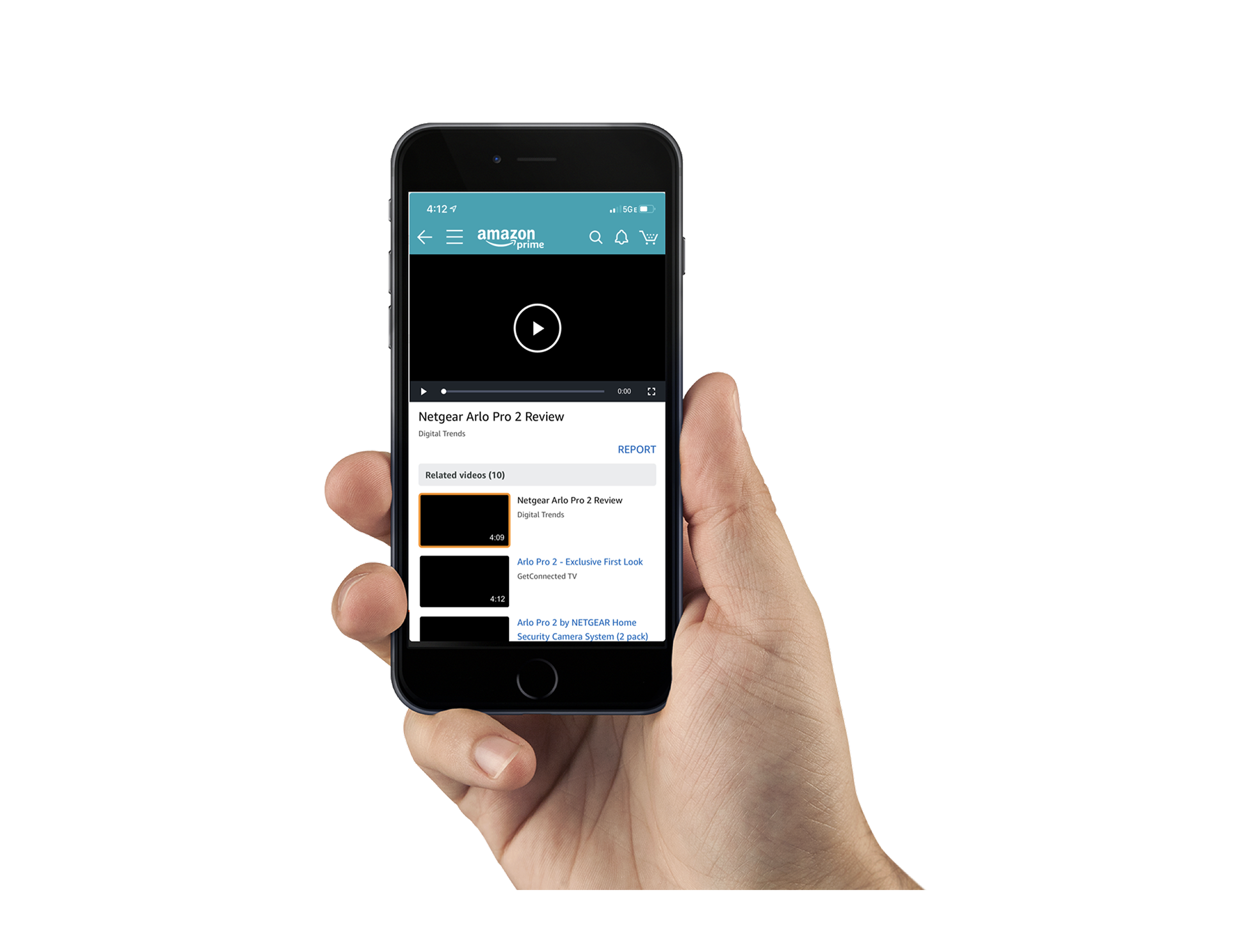
Amazon Video Lightbox
Enhanced video engagement on product pages with a focused lightbox experience.
Visual Interactive Voice Response
A smarter, visual version of phone-based support for Microsoft product activation.
Amazon Creator Portal
Empowering customers to upload product videos through an intuitive portal.