Commerce / Mobile / 2017–2018
Mobile Video Lightbox: watch and browse without losing your place.
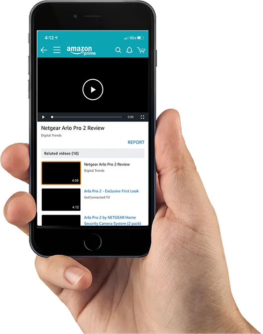
A redesigned video experience for the Amazon mobile app that makes it easier to browse, watch, and discover product videos — so shoppers can keep exploring content while a video plays.
This portfolio showcases my personal work and design projects. While some content may reference my professional experience at Amazon, all views, opinions, and designs presented here are my own and do not reflect the official policy or position of Amazon. Any data or information displayed is either publicly available or has been anonymized to protect confidentiality. This portfolio is intended solely to demonstrate my skills and experience in UX design.
01 / Overview
What it is
The Video Lightbox project set out to enhance video views on Amazon by offering a more engaging, user-friendly way to browse, watch, and discover video content.
Imagine this…
Emily is browsing the Amazon mobile app on her phone, searching for a portable blender. After typing her query and scrolling through the results, she taps a product that catches her eye. On the product detail page, she notices a video thumbnail with a play icon among the product images.
Curious, she taps it, and a lightbox opens — dimming the background and playing the video in a focused overlay. The video demonstrates the blender in action: blending fruit, charging via USB, and fitting easily into a gym bag. Once finished, Emily taps close to exit the lightbox and returns to the product page, now more confident in her purchase decision.
02 / Problem
Product videos were difficult to discover and browse
Product videos on Amazon were underused. Watching one required leaving the product page, while horizontal browsing on mobile was frustrating and led to low engagement.
The solution was a focused lightbox that kept shoppers on the product page, introduced intuitive vertical navigation, and supported related-content discovery.
03 / Objectives
What the project aimed to do
- Increase video engagement: create a user-friendly interface that encourages more video watching and interaction.
- Improve navigation: provide intuitive navigation, transitioning from horizontal to vertical, for easier browsing.
- Enhance user experience: ensure a seamless experience with an accessible video player and uninterrupted browsing.
- Boost retention: improve video viewing and discovery to increase retention and time spent on the platform.
03 / Competitive analysis
What else has been tried
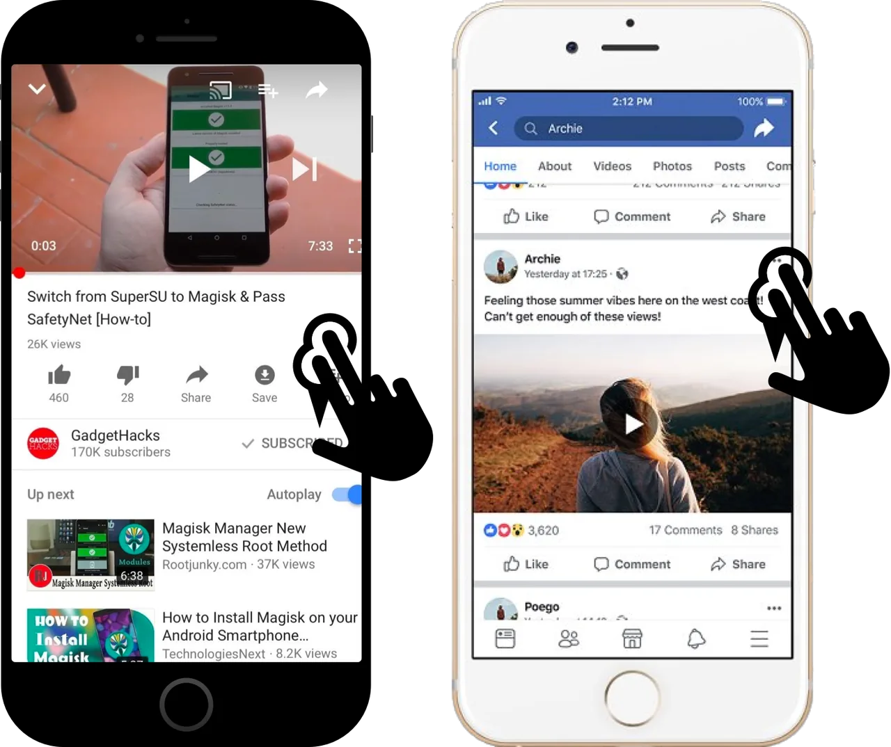
I performed a thorough analysis of other mobile video apps to understand their strengths and weaknesses. This helped me learn from existing features and interactions, and informed my decision to implement vertical navigation — the pattern most frequently used across other video platforms.
04 / Wireframing
Two concepts: Card and Fixed
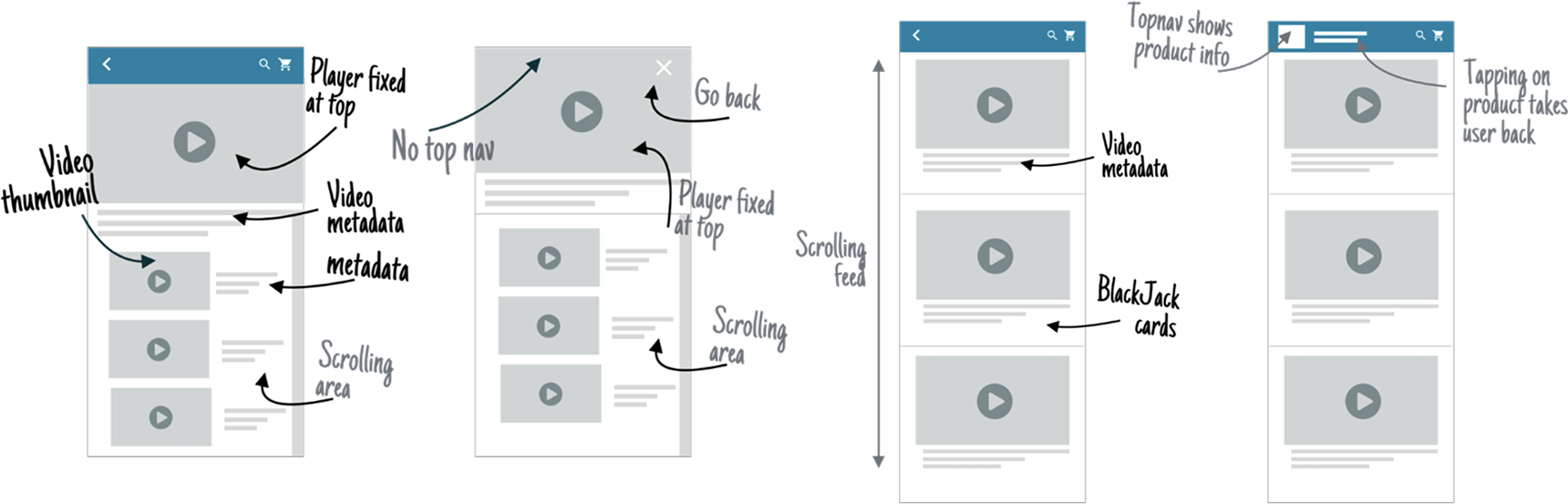
During ideation, I focused on improving navigation to enhance the experience. Competitor analysis showed that vertical navigation is common across video platforms, which guided my choices. This led to two final concepts:
- Card: presents videos in a card format with inline autoplay, letting users navigate through videos while the main video plays at the top.
- Fixed: replaces the lightbox with a vertically scrolling list of video cards, so users can explore other content seamlessly while the main video plays at the top.

05 / Evaluate
Testing the two directions
I partnered with my PM to evaluate the new UI with five participants. Interestingly, 80% favored navigating videos while the main video played at the top, letting them explore other content seamlessly. Based on the feedback, I recommended that leadership implement the "Fixed" model.
The prototype was built in Axure RP. To get more accurate feedback, I uploaded the Axure files to my personal server so participants could access the prototype from a mobile device — a very realistic testing experience.
"I like to watch a video while I can navigate on the screen."
Usability test participant
06 / Design rationale
Why vertical navigation
The choice to implement vertical navigation instead of horizontal navigation was influenced by several factors aligned with user behavior:
- User engagement: vertical navigation lets users view a video while browsing others at the top, improving engagement.
- Visibility of options: it provides a wider view of available videos than horizontal navigation, aiding discovery.
- User preferences: users prefer to browse videos while watching one, which vertical navigation supports.
- Competitor analysis: vertical navigation is prevalent in mobile video apps, making it familiar.
- Usability testing: guerrilla testing showed 80% of participants preferred vertical navigation, reinforcing its potential.
07 / Impact
More engagement, with trade-offs
35%
Increase in video views.
2.5×
More videos watched per session.
40%
Longer watch time.
28%
Lower bounce rate.
The redesign significantly improved video engagement rates, with customers spending more time watching videos on mobile devices. The vertical navigation pattern increased video discovery and reduced bounce rates. While the initial scope included additional features such as browsing video feedback, the MVP validated the core hypothesis: users prefer navigating videos while watching content at the top of the screen. This foundation set the stage for future iterations and feature expansion.

08 / Reflection
Challenges faced as a designer
As the only designer on the team, I faced several challenges. Balancing responsibilities was tough — I managed multiple tasks at once, including designing interfaces, collaborating with team members, and ensuring effective communication. Clear communication was crucial to keep everyone aligned and my design concepts understood.
Collaboration was key, especially when integrating designs with technical constraints, which often required adjustments. Managing feedback and revisions demanded attention to detail and adaptability — staying open to constructive criticism while maintaining the integrity of my design vision.
More case studies
All work
Creator Portal
CommerceLetting customers add videos to their favorite products through a related-video widget.
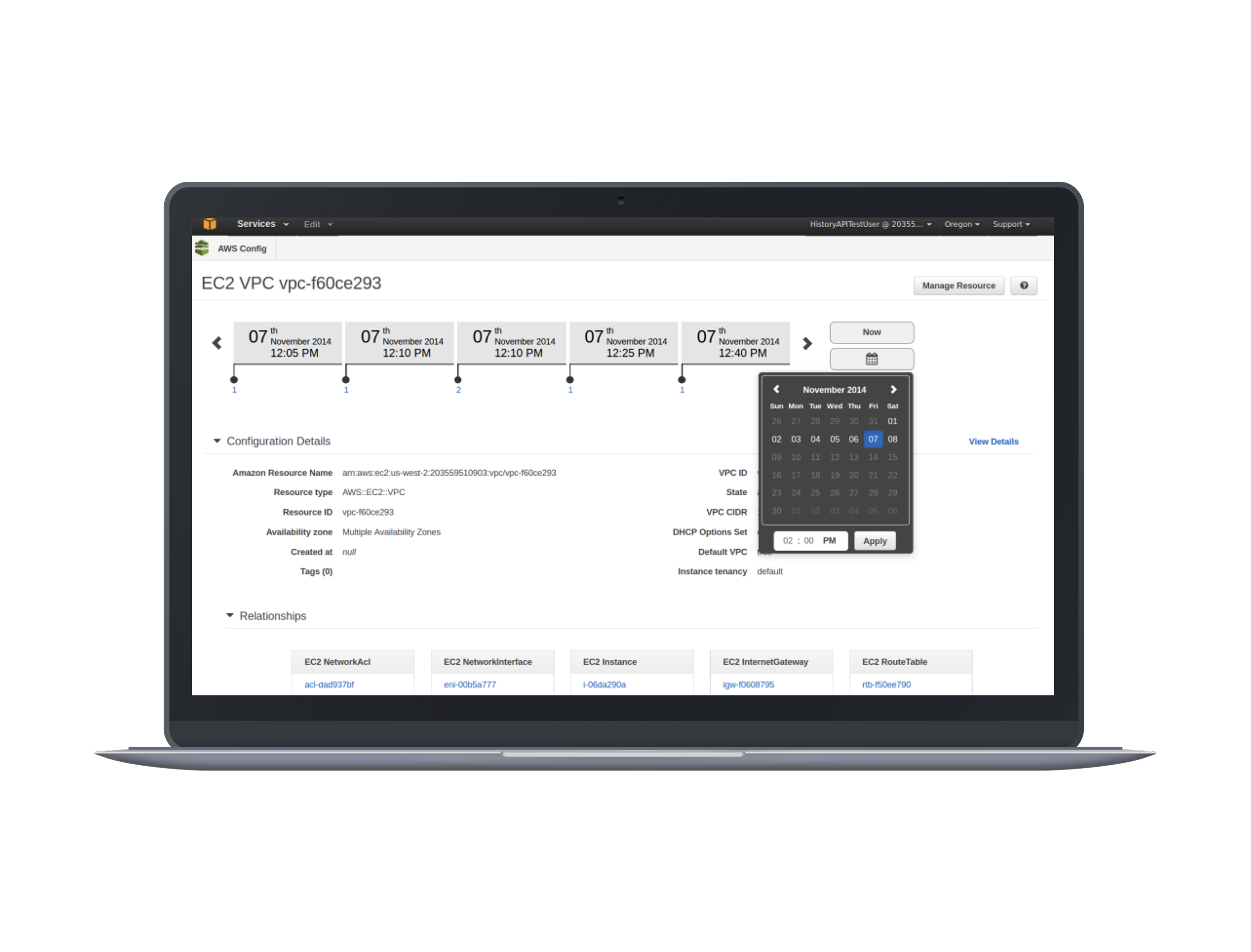
Building AWS Config
Cloud infrastructureAssessing and auditing configuration changes across cloud resources over time.
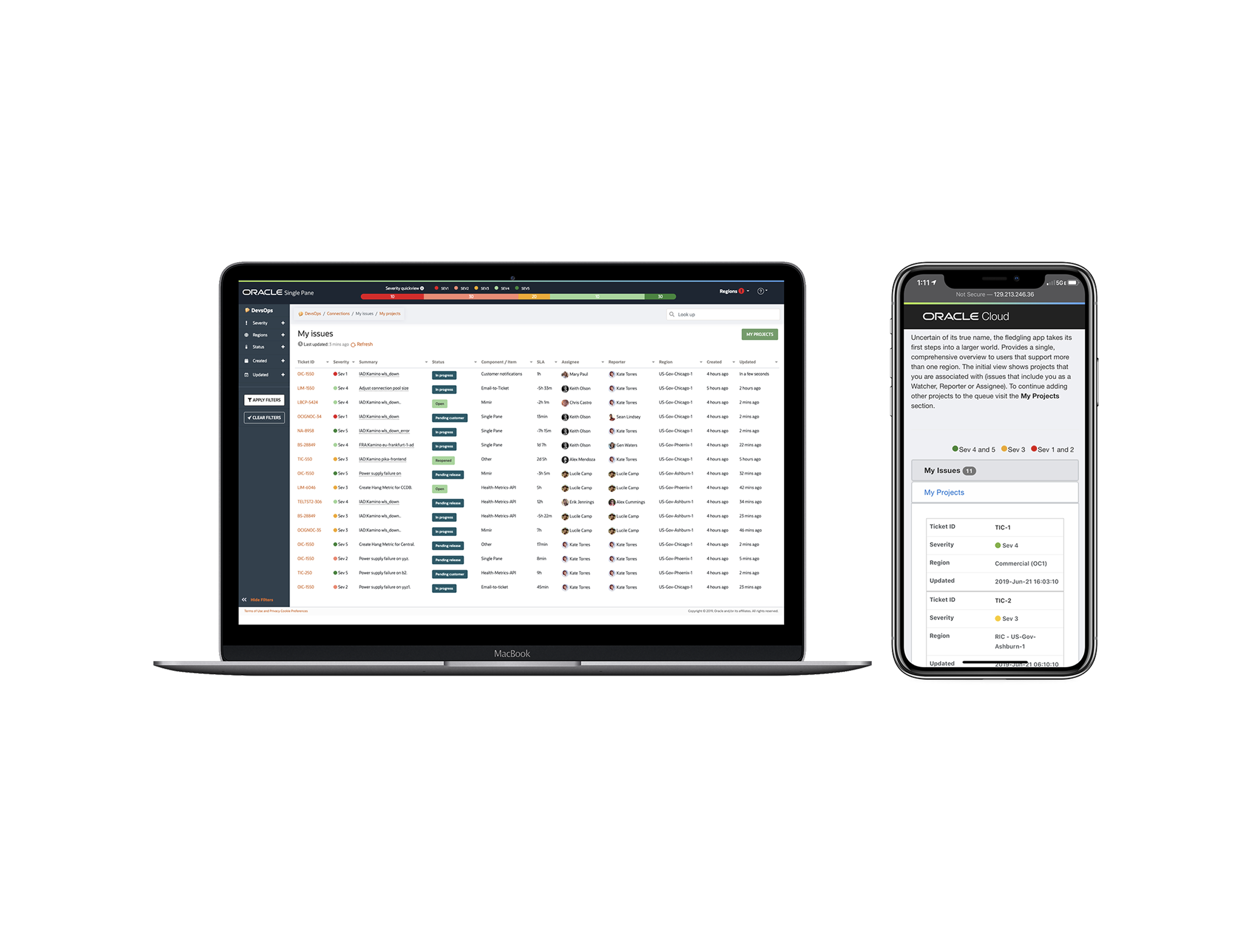
Oracle Single Pane
Cloud operationsA unified workspace for managing many service instances without parallel tabs.